
Tines. Soft warm white, deep violet edges, specimen cards in pastel tints.
- SaaS
- Light theme
- 20 colors
- 2 typefaces
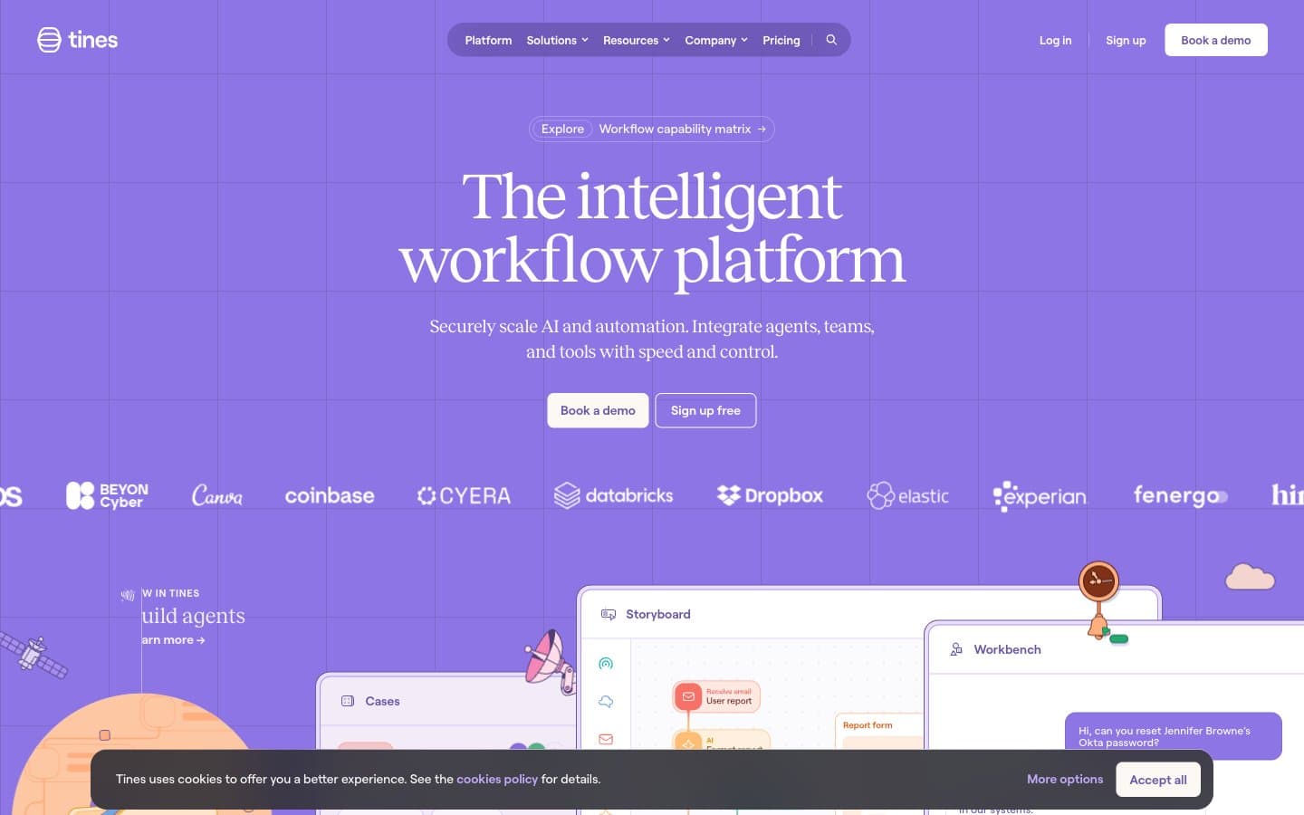
Tines is a violet-drenched observatory: a soft, warm-white canvas (#fcf9f5) layered with a deep iris (#4d3e78) that saturates borders, text, and iconography like ink on parchment. Reckless serif headlines sit at whisper-weights (300) with tight negative tracking, while Roobert sans carries all UI at near-equal weight. The system replaces typical flat SaaS chrome with hand-drawn whimsy: illustrated clouds, paper planes, and sprouts float across sections as decorative atmosphere. Cards are the signature element — pastel-tinted backgrounds paired with vivid, saturated 2px borders in pink, orange, green, or teal, creating a 'lab notebook' feeling where each story is its own labeled specimen. Buttons are quietly confident: ghost outlines on hero CTAs, pill-shaped deep-violet fills for booking, and zero drop-shadow elevation throughout.
Tines design system

Brand3
Primary brand color, dominant borders, body text, icon strokes, link color — saturates the interface like violet ink on parchment
Secondary brand violet for mid-weight text, secondary borders, and decorative iconography
Filled primary action button background — the only filled CTA color, used sparingly to make Book a demo / Sign up commands feel switched on
Accent14
Soft violet-tinted surface for cards, table rows, and section backgrounds
Mint-tinted card surface for testimonial and feature cards
Peach-tinted card surface for warm-coded testimonial cards
Pink-tinted card surface for pink-themed testimonial cards
Blue-tinted card surface for blue-themed testimonial cards
Vivid pink accent for specimen-card borders, icon fills, and decorative illustration strokes
Vivid orange accent for specimen-card borders, icon strokes, and secondary callouts
Green outline accent for tags, dividers, and focused UI edges
Vivid blue accent for specimen-card borders and tech iconography
Vivid teal accent for specimen-card borders and unique illustration touches
Secondary blue border for grid-card variants and icon strokes
Deep maroon for text emphasis, badge labels, and inline highlights on warm cards
Red accent for outlined action borders, linked labels, and lightweight interactive emphasis. Use as a supporting accent, not as a status color
Red decorative accent for icons, marks, and small graphic details. Use as a supporting accent, not as a status color
Neutrals3
Muted violet surface for table headers, footer accents, and subtle dividers
Primary page canvas — warm off-white, the base layer everything sits on
Card foreground, inverted text on dark surfaces, base layer for product screenshot cards
Try a pairing
Pick any two colors from the palette to check whether text stays readable on top.
Aa
Pure on Deep Iris
9.23 : 1 contrast
- Body textPasses AA 4.5
- Large textPasses AA 3
- StrictPasses AAA 7























