
Tilda. Paper sketchbook with coral crayon.
- SaaS
- Light theme
- 9 colors
- 3 typefaces
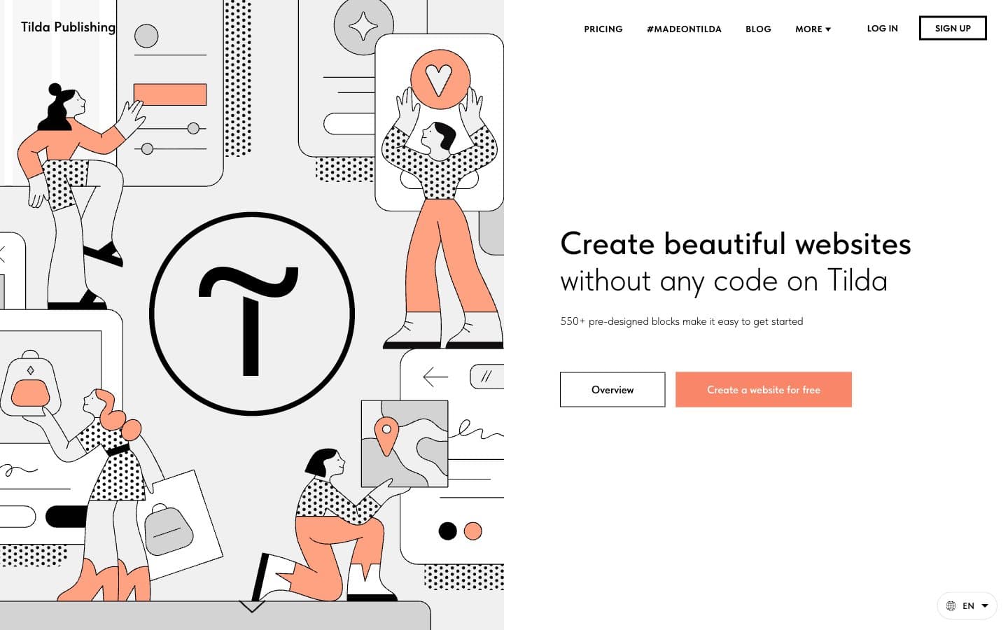
Tilda operates on a near-monochrome canvas with a single vivid coral accent doing all the emotional work. The aesthetic is editorial-illustration-meets-builder-tool: flat, hand-drawn line art fills the left side of heroes, generous whitespace breathes around light-weight headlines, and one orange-coral button is the only spot of color in an otherwise achromatic interface. Typography carries the personality — TildaSans at weight 300 whispers across 60-78px hero headlines, while the coral accent is rationed for primary actions, illustration fills, and icon highlights. Components are confident and pill-shaped: 100px radius buttons, flat surfaces with no shadows, thin black borders instead of elevation. The system should feel like a design magazine that accidentally became a product page.
Tilda design system

Brand1
Orange supporting accent for decorative details and low-frequency emphasis. Do not promote it to the primary CTA color
Neutrals8
Primary text, button strokes, dark mode contrast pairs, icon outlines
Dark surface blocks, footer regions, inverted section backgrounds
Supporting neutral for secondary UI, dividers, and muted labels. Do not promote it to the primary CTA color
Secondary dark surface, hover states on dark backgrounds
Muted helper text, placeholder text, disabled icon outlines
Button hover backgrounds, disabled controls, subtle surface tints
Light supporting surface for subtle backgrounds and section separation. Do not promote it to the primary CTA color
Page canvas, card elevation, button text on dark fills, content surface
Try a pairing
Pick any two colors from the palette to check whether text stays readable on top.
Aa
Ink Black on Coral Signal
8.68 : 1 contrast
- Body textPasses AA 4.5
- Large textPasses AA 3
- StrictPasses AAA 7























