
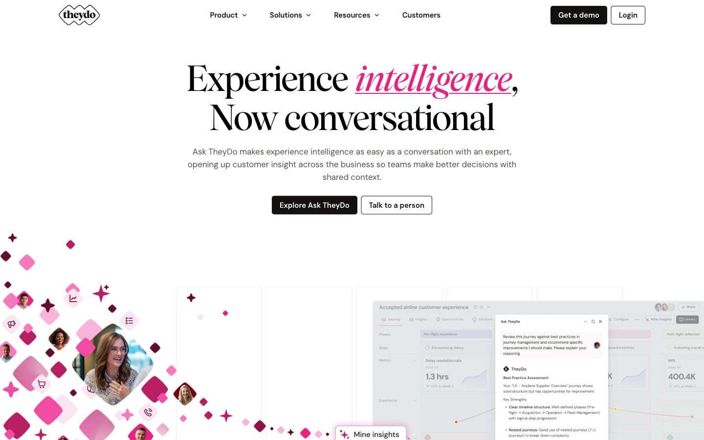
TheyDo. Blush editorial spread with magenta confetti.
- SaaS
- Light theme
- 13 colors
- 3 typefaces
TheyDo reads as an editorial product page printed on warm blush paper: a soft #fce7f3 canvas (never cold white) carries a confident serif headline (Wulkan) that pairs with a pragmatic sans (DM Sans) for body and UI. The visual identity is built on a single saturated hot-pink (#e82183) used exclusively as outline, stroke, and italic accent — never as a filled surface — which keeps the interface calm while still feeling branded. Floating magenta diamond motifs (echoing the TheyDo logo mark) scatter across the hero like confetti, establishing a playful geometry that recurs in card borders and section dividers. Components are flat and border-driven: 8px corners, 1px hairline rules (#c6c3c3 or pink tints), no shadows, and dark charcoal filled buttons (#131110) as the single primary action. The rhythm is generous — 80px between sections, 15–20px within cards — producing a spacious, magazine-like cadence rather than a dense SaaS dashboard.
TheyDo design system

Brand1
The single brand accent — italic headline words, decorative diamond strokes, icon outlines, and outlined/ghost action borders. Never used as a filled surface or background
Accent2
Pink-tinted card borders that carry the magenta family into container edges without the visual weight of the vivid hue
Mid-saturation pink border accent for highlighted cards and decorative borders that need more presence than Rose Whisper
Neutrals10
Secondary text color, icon strokes, and sharp typographic accents where maximum weight is needed without warmth
Primary text, filled primary-action buttons (Get a demo, Explore Ask TheyDo), and the nav's dark CTA — the heaviest value in the system
Body text, nav labels, and list copy — slightly warmer than pure black, carries the paragraph voice
Deep muted text for sub-labels and fine print
Muted helper text, secondary link color, and disabled-state labels — the quietest text tier
Tertiary body and caption text — barely darker than Stone, used for timestamp-style metadata
The dominant border color (2,700+ occurrences) — 1px dividers, card edges, list separators, link underlines. The structural skeleton of every layout
Secondary card borders and subtle internal dividers where Hairline would feel too heavy against the blush canvas
Primary page canvas, hero washes, and large background blocks — the warm off-white that replaces cold #ffffff in most full-page contexts
Card surfaces, button text on dark fills, and the contrast layer that sits on top of the blush canvas inside containers
Try a pairing
Pick any two colors from the palette to check whether text stays readable on top.
Aa
Black on Magenta Pop
4.98 : 1 contrast
- Body textPasses AA 4.5
- Large textPasses AA 3
- StrictFails AAA 7























