
Tedy. Pastel surface washes on white, one hot pink doing all the urgent work.
- SaaS
- Light theme
- 13 colors
- 2 typefaces
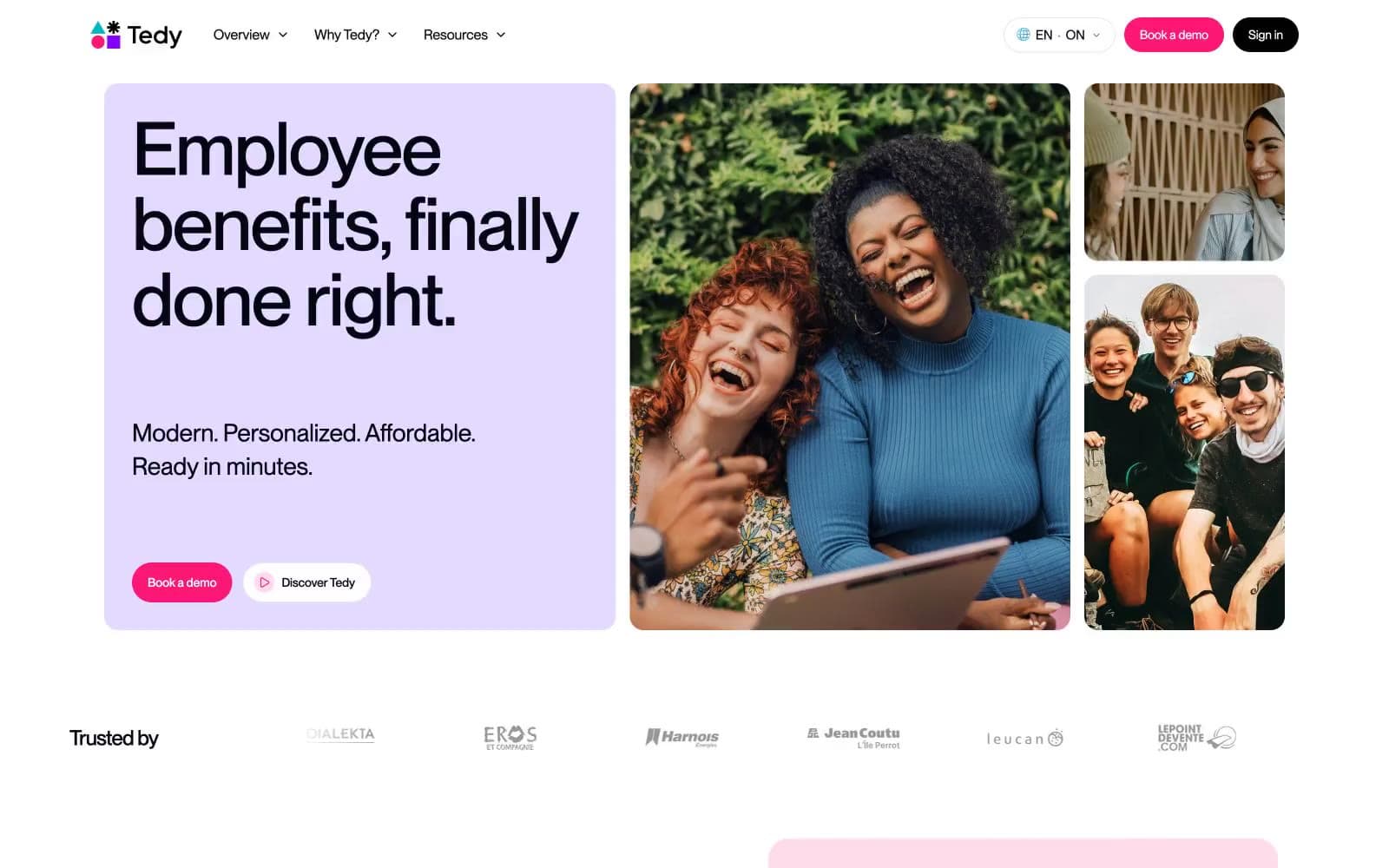
Tedy operates in a soft pastel universe built on one disciplined trick: a near-white canvas flooded with candy-colored surface washes (lavender, mint, butter, sky) and a single hot raspberry (#fd1774) doing all the urgent work. The pink is the only saturated color in the entire system — every CTA, every action surface, every tension point comes from that one hue, with a signature raspberry-tinted shadow extending 18px below it. Typography is where the system gets unexpectedly loud: Montreal Neue hits 104px at line-height 0.90 with tracking pulled to -6.5%, producing poster-etched density that contradicts the soft surroundings — headlines are set almost on top of themselves. Radii are uniformly generous (32px on cards, 999px on buttons, nothing sharp anywhere), and the atmosphere is amplified by colored radial-gradient glows that make the white space feel lit rather than empty.
Tedy design system

Brand1
Primary CTA fill, active states, colored shadow accents — the sole saturated hue in the system, creating urgency against matte pastels
Accent7
Hero card background, testimonial card wash, section surface — the dominant pastel; Hero gradient base — soft lavender fading downward into white; Composite atmospheric glow — purple/pink/teal/amber radial halos blending on white canvas
Feature card surface, success-tinted badges, body wash — pastel green for nature/wellness cues
Warning-tinted badges, warm section wash, pill highlights
Soft section background, alternate surface, and quiet card fill
Warm neutral section surface, cream card backgrounds
Green decorative accent for icons, marks, and small graphic details. Use as a supporting accent, not as a status color
Blue decorative accent for icons, marks, and small graphic details. Use as a supporting accent, not as a status color
Neutrals5
Neutral form states, badge text, and quiet UI feedback where color should stay understated. Do not promote it to the primary CTA color
Dark elevated surface for cards, headers, and contained panels. Do not promote it to the primary CTA color
Muted body text, secondary borders, de-emphasized labels
Hairline dividers, ghost button borders, list separators
Page canvas, card surfaces, button text, ghost button fill
Try a pairing
Pick any two colors from the palette to check whether text stays readable on top.
Aa
Ink Black on Raspberry Pulse
5.32 : 1 contrast
- Body textPasses AA 4.5
- Large textPasses AA 3
- StrictFails AAA 7























