
Tally Forms. A gray-paper canvas scattered with magenta-pink hand-drawn marks and centered editorial headlines.
- SaaS
- Light theme
- 11 colors
- 1 typeface
Tally's visual system reads as 'notebook doodles on warm paper' — a quiet, editorial interface where a warm gray canvas (#e0e0df) carries white card surfaces and almost everything else steps out of the way so that one vivid magenta-pink (#f81ce5) can do the emotional work. That pink is reserved for illustration strokes, icon outlines, and the occasional decorative border on a feature card — it never fills a button. Conversion is handled by a single classic blue (#0070d7), keeping brand expression and action expression separate. Typography is Inter in a wide weight range, tracked tight at -0.031em, with a 64px display headline that feels closer to a magazine masthead than a SaaS hero. Hand-drawn squiggles, underlines, and star/confetti motifs float around the margins, turning the page edges into a sketchbook rather than leaving them as dead space. Cards are flat white on warm gray with a subtle warm-tinted shadow stack, rounded at 10px, and the overall rhythm is comfortable — generous gaps, centered hero, then 2-up feature columns.
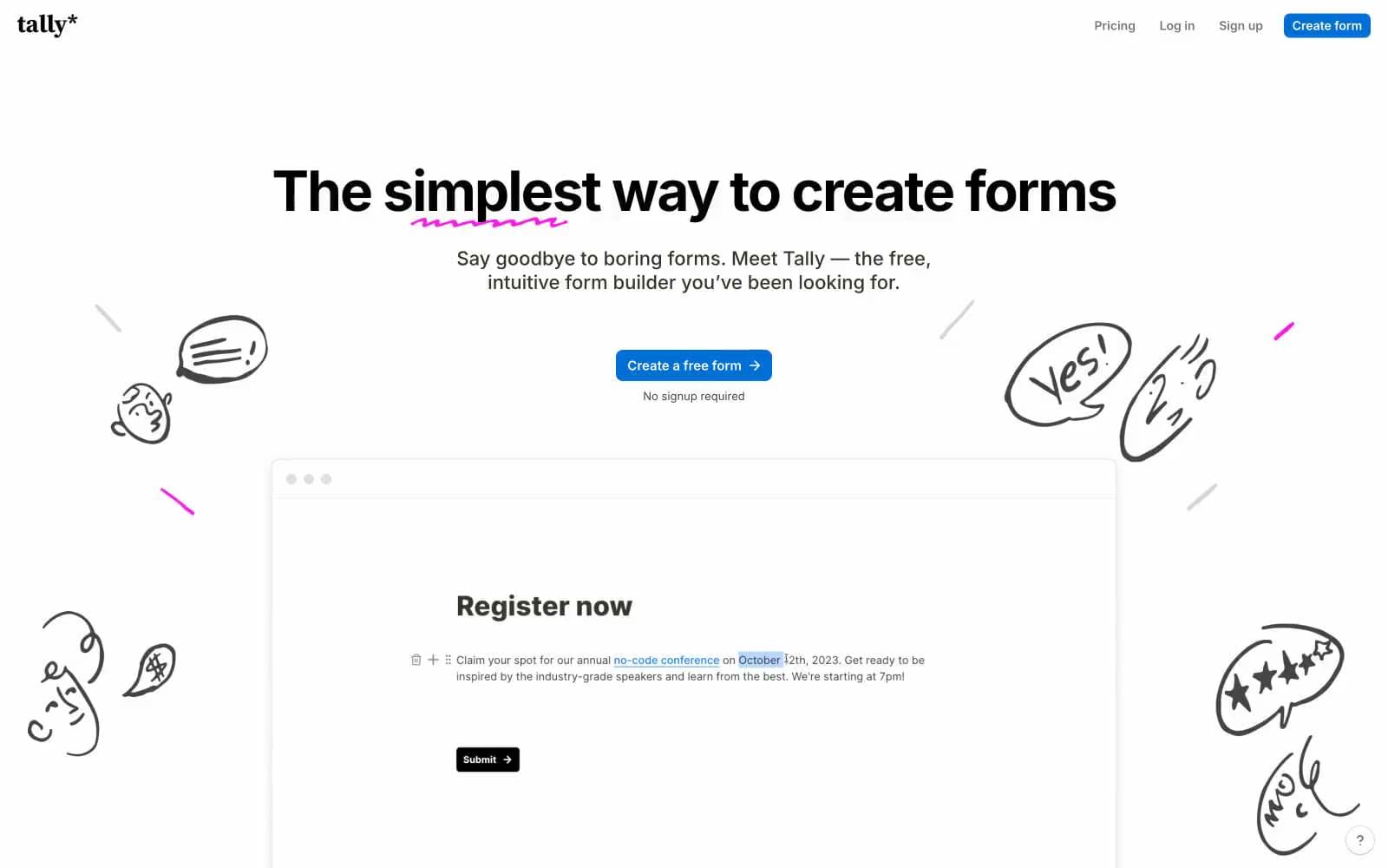
Tally Forms design system

Brand2
Pink decorative accent for icons, marks, and small graphic details. Do not promote it to the primary CTA color; Decorative focus-ring and glow tint used to draw the eye to a highlighted feature card, applied as a soft 2–4px outer ring rather than a fill
Primary action buttons only — the lone chromatic fill in the system, used to mark conversion moments without competing with the magenta brand mark
Accent1
Underline and streak flourishes under display headlines — a short linear sweep from violet to magenta that replaces the traditional squiggle
Neutrals8
Heading borders, the dark header CTA button fill, and the highest-contrast button text — reserved for moments that need maximum weight
Primary text, heading fills, and the dominant dark border color across cards, body elements, and form chrome. A warm near-black rather than pure black
Dark borders and separators for elevated surfaces and inverted UI. Do not promote it to the primary CTA color
Muted borders, inactive dividers, and low-emphasis strokes for icons and form elements
Secondary text, helper copy, and tertiary borders on icons and body elements
Page canvas — the warm light-gray background that all white card surfaces sit on. The signature surface of the system
Subtle elevated or muted surface for secondary panels, code blocks, and hover washes — a half-step darker than pure white
Card surfaces, form previews, input fields, and icon fills on the canvas. Provides the only bright surface layer
Try a pairing
Pick any two colors from the palette to check whether text stays readable on top.
Aa
White on Action Blue
4.88 : 1 contrast
- Body textPasses AA 4.5
- Large textPasses AA 3
- StrictFails AAA 7























