
Syllabus. Cream-paper magazine meets geometric sans-serif.
- SaaS
- Light theme
- 6 colors
- 2 typefaces
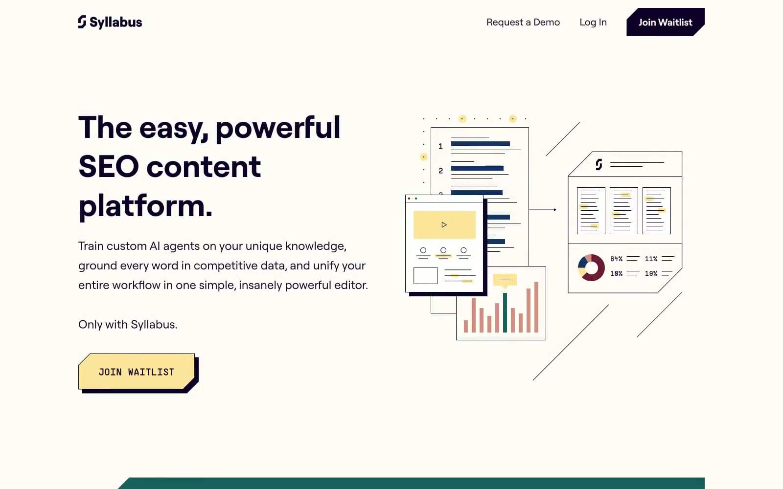
Syllabus operates as a warm, editorial-tech environment: a cream paper-like canvas with deep violet as the near-black structural color, punctuated by buttery yellow interactive surfaces and teal section blocks. The aesthetic reads like a premium print magazine reinterpreted as a product — flat illustrations with selective color fills, generous vertical breathing room, and confident oversized headlines. Typography is restrained to one custom geometric sans (Roobert) that carries personality through scale jumps rather than weight contrast. The single signature trick: yellow CTA buttons with a hard offset shadow, turning every action into a physical, pressable artifact against the cream.
Syllabus design system

Brand3
Violet accent for outlined action borders, linked labels, and lightweight interactive emphasis. Do not promote it to the primary CTA color
Yellow wash for highlight backgrounds, decorative bands, and soft emphasis behind content. Do not promote it to the primary CTA color
Dark section backgrounds for contrasting content blocks and nav text. Used as a full-bleed band color when a section needs to shift away from the cream canvas into a more saturated, grounded tone
Neutrals3
Hard-offset button shadow color and SVG illustration fills. Never used as text or large surface — only as the 1–3px offset shadow behind Butter Yellow buttons and as fill on line-art elements that need maximum contrast
Primary page canvas and card surface — replaces the default pure white. The slight warm tint is the most distinctive choice in the system; it makes the violet ink and yellow accent feel intentional rather than stark
Inset card surfaces and elevated panels layered over the cream canvas. Used when a component needs to feel lifted off the paper without introducing a tint
Try a pairing
Pick any two colors from the palette to check whether text stays readable on top.
Aa
Pure White on Ink Violet
19.93 : 1 contrast
- Body textPasses AA 4.5
- Large textPasses AA 3
- StrictPasses AAA 7























