
Surfshark. Warm coral sun meets teal sea, all floating on white sand.
- SaaS
- Light theme
- 13 colors
- 1 typeface
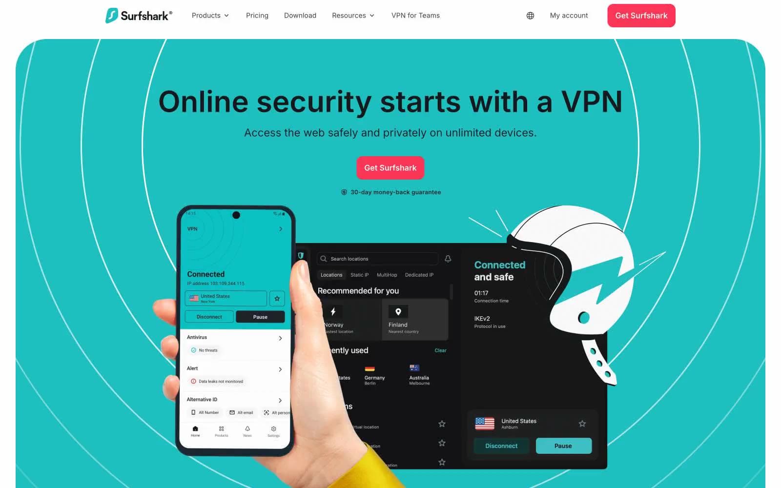
Surfshark's design language is a confident light-mode consumer SaaS anchored by a vivid teal brand mark and a warm coral primary action. Dark charcoal hero cards and feature panels provide high-contrast resting places between airy white sections, creating a rhythm of dark→light→dark that frames the product as both trustworthy and modern. Typography is exclusively Inter with a wide size range (12–60px) and a slight negative tracking at display sizes that tightens headlines without feeling clinical. Components lean rounded and pill-like — 48px card radii, 12px button radii — giving the interface a friendly, approachable feel. The three-color accent system (teal for brand identity, coral for conversion, yellow for promotional urgency) keeps the chromatic footprint tiny but high-impact, while a deep neutral scale handles 95% of the UI.
Surfshark design system

Brand2
Brand mark icon, accent highlights, inline link emphasis — the signature chromatic thread that ties logo, headings, and accent text together
Primary action buttons, high-urgency CTAs — warm pink-red against the cool palette creates immediate conversion pull
Accent1
Promotional banner background, limited-time deal strips — golden yellow reserved exclusively for urgency framing
Neutrals10
Maximum-contrast borders, SVG icon fills, structural strokes — used heavily for crisp 1px rules
Primary text, dark hero backgrounds, footer surfaces, button text on coral — near-black with a hint of cool depth
Alternate dark surface — slightly bluer than Charcoal, used in distinct dark panels
Navigation borders, tertiary UI elements, slightly lighter than Charcoal for layered depth
Muted body text, secondary copy, icon strokes in resting state
Secondary borders, disabled states, heavy-use divider color (highest neutral frequency after black)
Light borders, dividers, subtle separation lines — cooler-toned hairline color
Faint teal-tinted surface wash — barely-perceptible background variant for feature blocks
Alternate canvas surface, subtle card backgrounds, soft section differentiation from pure white
Page canvas, card surfaces, button text on dark fills, text on coral CTAs
Try a pairing
Pick any two colors from the palette to check whether text stays readable on top.
Aa
Carbon on Surfshark Teal
9.26 : 1 contrast
- Body textPasses AA 4.5
- Large textPasses AA 3
- StrictPasses AAA 7























