
Superthread. Whiteboard confidence with amber highlighter energy.
- SaaS
- Light theme
- 10 colors
- 4 typefaces
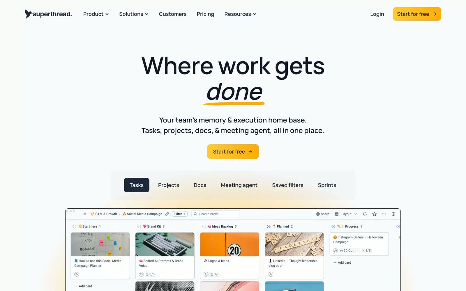
Superthread runs on a whiteboard-meets-editorial visual logic: a near-white canvas, one warm amber accent that feels like a highlighter swipe, and a very heavy reliance on hard 1px dark borders to define structure instead of shadows or fills. The dark slate (#1d2939) carries almost all type and iconography, giving the system a confident, ink-on-paper weight; the amber only appears as a functional accent on the primary CTA and as the underline brushstroke beneath the italic word in the headline. Components are compact and border-driven: cards and buttons share a 10px radius, surfaces stay nearly flat with minimal elevation, and the yellow→gold gradient on the CTA creates a single source of warmth in an otherwise monochromatic page. Typography carries the personality — Vela Sans at 80px display weight with slight negative tracking, the word "done" set in italic with a hand-drawn yellow underline as the brand's signature gesture. Density is compact, gaps hover around 10–15px between elements, and the page breathes in large 64–80px section bands.
Superthread design system

Brand3
Primary headings, body copy, and filled button backgrounds — the dominant near-black that gives the system its editorial weight. Filled CTA buttons and active tab states use this as the base fill
Yellow accent for outlined action borders, linked labels, and lightweight interactive emphasis. Do not promote it to the primary CTA color
Supporting palette color for small decorative accents when the core palette needs contrast. Do not promote it to the primary CTA color
Accent1
Subtle violet-leaning tint used for soft decorative backgrounds and link accents — adds a cold counterpoint to the warm amber without competing with the primary accent
Neutrals6
Hairline borders, dividers, and icon strokes — the structural skeleton of every card, board, and list element. Used at full opacity in 1px widths to define edges instead of relying on shadows
Deep accent for high-emphasis headings and dark surface text where extra weight is needed beyond the default slate
Secondary and muted text — subheadings, helper copy, metadata, and inactive nav items
Secondary borders and neutral button backgrounds where heavy ink-black would be too aggressive — used on ghost controls and subtle dividers
Page-level background and section bands, creating a soft off-white canvas that lifts white cards without harsh contrast
Card and elevated surface backgrounds sitting above the page canvas
Try a pairing
Pick any two colors from the palette to check whether text stays readable on top.
Aa
Canvas White on Slate Ink
14.70 : 1 contrast
- Body textPasses AA 4.5
- Large textPasses AA 3
- StrictPasses AAA 7























