
Superhuman. Golden hour editorial dashboard.
- SaaS
- Light theme
- 9 colors
- 1 typeface
Superhuman sits at the intersection of editorial photography and software UI — a warm parchment canvas (never pure white) frames deep-maroon brand moments and vivid violet accents. Headlines whisper at weight 460 rather than shout, letting the cinematic full-bleed hero photograph do the emotional heavy lifting while translucent product UI cards float like glass over the image. The palette stays quiet and editorial most of the time: cream surfaces, charcoal text, hairline warm-gray borders, and generous spacing, with color reserved for deliberate brand punctuation — a single maroon CTA, violet links, a light-lilac secondary button. The system deliberately avoids heavy shadows and gradients on UI surfaces; depth comes from layered photography and subtle backdrop blur on the header, not from elevation stacks.
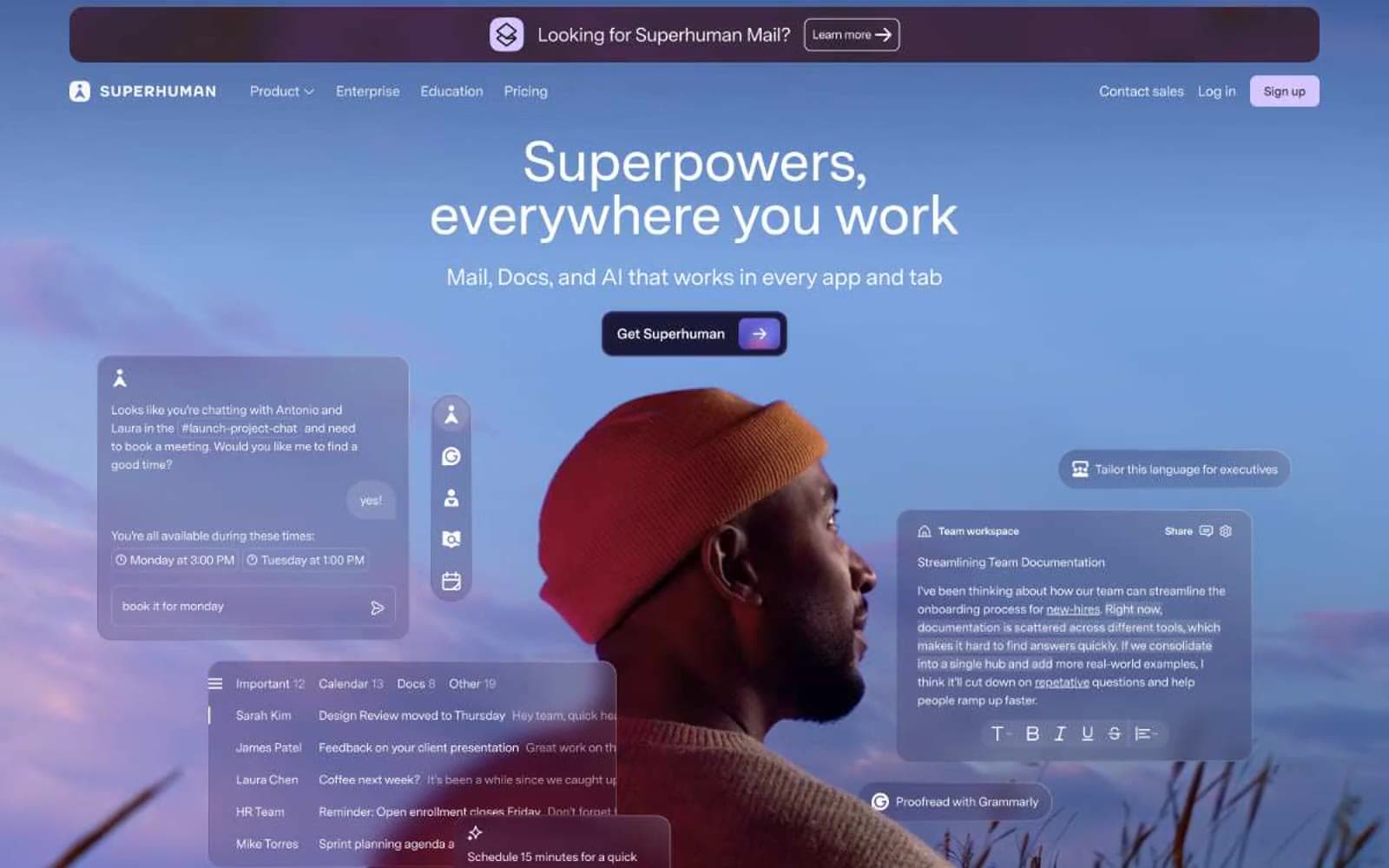
Superhuman design system

Brand2
Primary action buttons, announcement banner, footer — a warm near-black maroon that reads as ink rather than red, anchoring the palette without screaming
Violet text accent for links, tags, and emphasized short phrases. Do not promote it to the primary CTA color
Accent2
Secondary surface fills, light-tinted badges, ghost button backgrounds — desaturated violet that hints at the brand accent without claiming focus
Dark band section background for feature storytelling — the only dark surface in the system, paired with overlaid geometric art
Neutrals5
Primary text, headings, icon strokes — warm near-black with just enough brown to feel like ink on paper, never a cold #000
Secondary body text, helper copy, muted descriptions — the only mid-gray, used sparingly so it never competes with primary text
Hairline borders, card outlines, divider lines — warm light gray that disappears against parchment but defines edges crisply
Page canvas — the dominant surface; warm cream that replaces white as the base, giving the whole system an editorial warmth
Elevated card surfaces, floating UI overlays, text on dark backgrounds — reserved for cards that must lift off the parchment canvas
Try a pairing
Pick any two colors from the palette to check whether text stays readable on top.
Aa
Paper White on Midnight Wine
14.66 : 1 contrast
- Body textPasses AA 4.5
- Large textPasses AA 3
- StrictPasses AAA 7























