
Supahub. Soft daylight on a violet ridge.
- SaaS
- Light theme
- 15 colors
- 2 typefaces
Supahub is a sunlit feedback platform rendered in soft white space punctuated by violet confidence. The system favors a quiet, mostly achromatic canvas where a single vivid violet (#862fe7) carries all primary action weight, then lets decorative lavender, pink, and amber gradient orbs burst through hero and feature sections to dramatize product surfaces. Typography is a Bricolage Grotesque / Inter pairing: the geometric variable display face does the emotional heavy lifting at 48–56px with tight -0.025em tracking, while Inter handles dense UI, captions, and supporting copy in compact 14–16px weights. Components sit on a generous spacing rhythm with two dominant radii — 12px for buttons and small surfaces, and 9999px (pill) for avatars, tags, and decorative badges — producing a friendly, rounded, approachable product surface rather than an enterprise grid. The overall feeling is a modern SaaS product page that borrows energy from the consumer-app playbook: floating product mockups, gradient atmospheres, and testimonial walls treated as content wallpaper, never as filler.
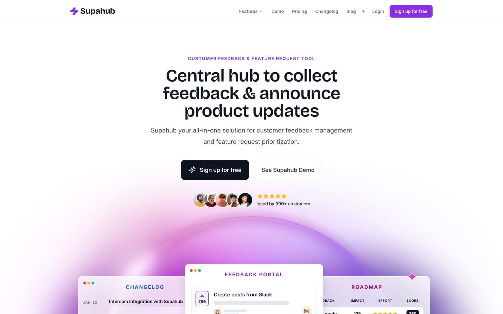
Supahub design system

Brand2
Primary filled action buttons, active nav state, key accent text — the single saturated brand anchor against the white canvas
Deeper violet for gradient stop, hover state, or emphasis text where Voltage Violet feels too bright
Accent6
Soft decorative violet for card backgrounds, icon tints, and gradient mid-stops
Lightest decorative violet wash for large surface fills behind product cards and feature bands
Pink wash for highlight backgrounds, decorative bands, and soft emphasis behind content. Do not promote it to the primary CTA color
Saturated pink gradient stop paired with violet in atmospheric gradient orbs
Warm orange accent in gradient orbs providing chromatic counterpoint to the violet/pink palette
Soft mint tint for highlighted feature panels and tag/badge backgrounds — appears as a chromatic counterpoint to violet
Neutrals7
Primary heading and body text, primary border, and filled dark action background (the dark CTA variant)
Secondary text, nav borders, muted UI text on white surfaces
Tertiary text, icon fills, helper copy, and supporting metadata
Hairline borders, input borders, button focus rings, subtle dividers
Violet wash for highlight backgrounds, decorative bands, and soft emphasis behind content. Do not promote it to the primary CTA color
Alternate section background, subtle surface lift above white
Primary card and surface background, button text on filled violet actions, inverted text
Try a pairing
Pick any two colors from the palette to check whether text stays readable on top.
Aa
Pure White on Voltage Violet
5.88 : 1 contrast
- Body textPasses AA 4.5
- Large textPasses AA 3
- StrictFails AAA 7























