
Streamtime. Designer scrapbook desk.
- SaaS
- Light theme
- 14 colors
- 2 typefaces
Streamtime reads like a creative agency scrapbook rendered in software: a warm cream canvas (#f1e8de) holds the page together while a small arsenal of vivid accent colors — sun yellow, hot pink, lime, blue, green — explode across cards, buttons, and decorative shapes like paper cutouts. Typography does the heavy lifting: both Ease Standard and Ease Display run at a single 400 weight, so hierarchy is built through scale (12px body to 100px display) and tight negative tracking, not through bolding. The system alternates between light editorial sections and one dramatic near-black (#2f2c29) hero band, creating a print-magazine rhythm. Surfaces stay mostly flat with hairline black borders and soft warm shadows rather than elevations; the only round elements are large pill buttons (96-160px radius) that feel like sticker labels pressed onto a page.
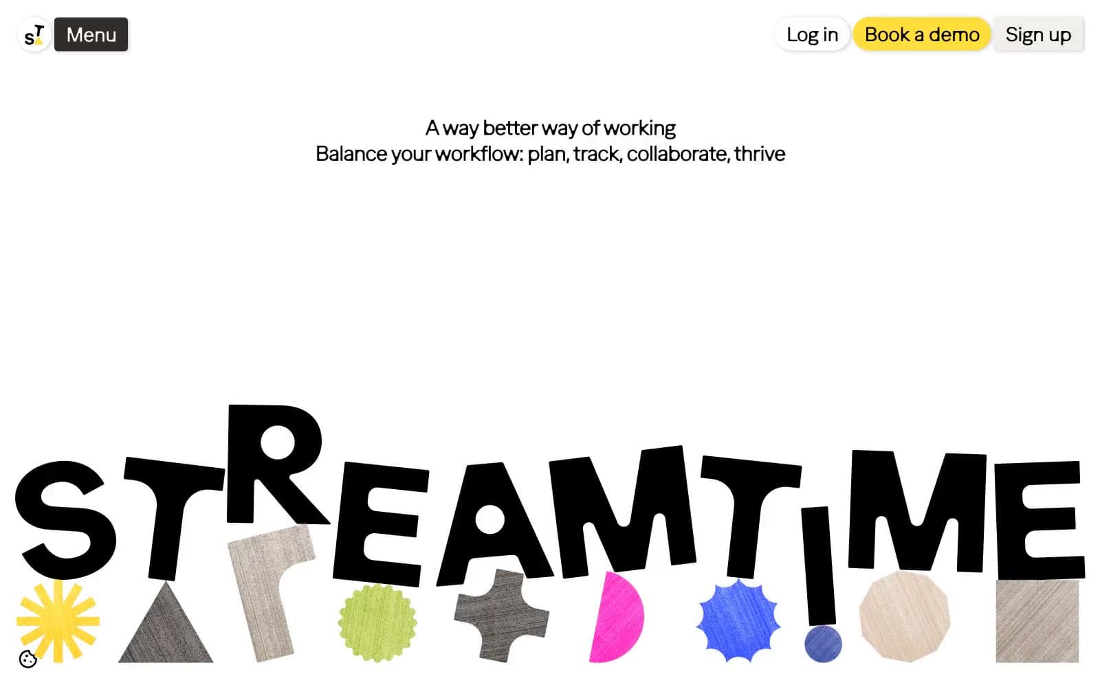
Streamtime design system

Brand1
Primary action buttons, card highlights, decorative shapes, the signature pop — the only color with true filled-button authority
Accent5
Decorative borders, accent shapes, image overlays — used as visual punctuation, never as fill
Decorative strokes, border accents, secondary highlight — energetic counterweight to Sun Yellow
Card background, secondary action — the cool blue in an otherwise warm palette
Card backgrounds, nav highlights — warmer, more muted companion to Lime Burst
Soft pink accent for secondary nav elements and tag pills
Neutrals8
Primary text, hairline borders, icon strokes, logo — the structural color, used at extreme scale
Dark hero section background, high-contrast text container — not pure black, a warmer near-black
Muted borders, secondary dividers, disabled states
Muted card backgrounds, secondary surfaces, neutral button fills
Warm neutral for soft fills, secondary card backgrounds
Primary page canvas, soft shadow color, border tint — the warm cream that holds the whole system together
Card surfaces, elevated content blocks — barely warmer than pure white, just enough to feel like paper
Hairline borders, dividers, input outlines, and card edges on light surfaces. Do not promote it to the primary CTA color
Try a pairing
Pick any two colors from the palette to check whether text stays readable on top.
Aa
Ink on Sun Yellow
15.76 : 1 contrast
- Body textPasses AA 4.5
- Large textPasses AA 3
- StrictPasses AAA 7























