
Squarespace. Cinematic monochrome gallery.
- SaaS
- Light theme
- 6 colors
- 3 typefaces
Squarespace speaks in absolute black and white — a purely achromatic system where drama comes from scale, contrast, and full-bleed photography rather than color. The visual identity is cinematic: a single massive headline floats over a full-bleed photographic hero, then the page alternates between stark black bands and white expanses, each section announcing itself through scale rather than color. Typography carries the entire brand voice — Clarkson, a custom geometric sans, is used at whisper-light 300 weight for huge 64–72px displays with aggressively tight tracking (-0.06em), creating a serif-like density that feels editorial. Components are intentionally minimal: ghost buttons, pill-shaped filter tabs, dark image cards with arrow indicators. The system is deliberately austere so user content (the websites being built) inherits all the visual energy.
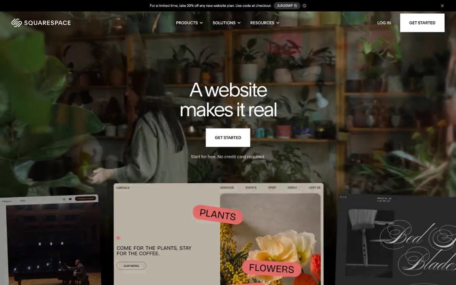
Squarespace design system

Neutrals6
Primary text, nav bar, black section bands, dark feature cards, logo mark
Filled button background, elevated dark surfaces — softer than pure black, reads as premium matte
Muted body text, secondary borders, de-emphasized labels on dark backgrounds
Tertiary text, very subtle UI dividers, placeholder-level hierarchy
Light borders, button outlines on light surfaces, subtle dividers, pill-tab inactive background
Page background, hero text on dark imagery, light section canvases, button text on filled buttons
Try a pairing
Pick any two colors from the palette to check whether text stays readable on top.
Aa
Paper on Obsidian
21.00 : 1 contrast
- Body textPasses AA 4.5
- Large textPasses AA 3
- StrictPasses AAA 7























