
Sprig. Quiet, almost inkless, with warm light leaking in at the edges.
- SaaS
- Light theme
- 17 colors
- 2 typefaces
Sprig operates in a near-monochrome editorial register: a warm bone-white canvas, hairline borders, and a single ink tone so dark it reads as black but carries a barely-there navy undertone. The system feels like a research notebook — quiet, confident, and deliberately undecorated — punctuated by warm sunset gradients that act as section markers rather than decoration. Typography is two custom families in conversation: ABC Diatype for the editorial moments (headings, display) and TT Commons Pro for the functional UI (nav, buttons, labels). Components are pill-shaped and generously spaced; cards can be nearly circular (100px radius) for feature moments, creating a visual contrast between the very-soft and the very-structured. Color is rationed: the only chromatic color in the interface is the near-black ink itself, and gradients are reserved for hero and event imagery — never on buttons, never on controls.
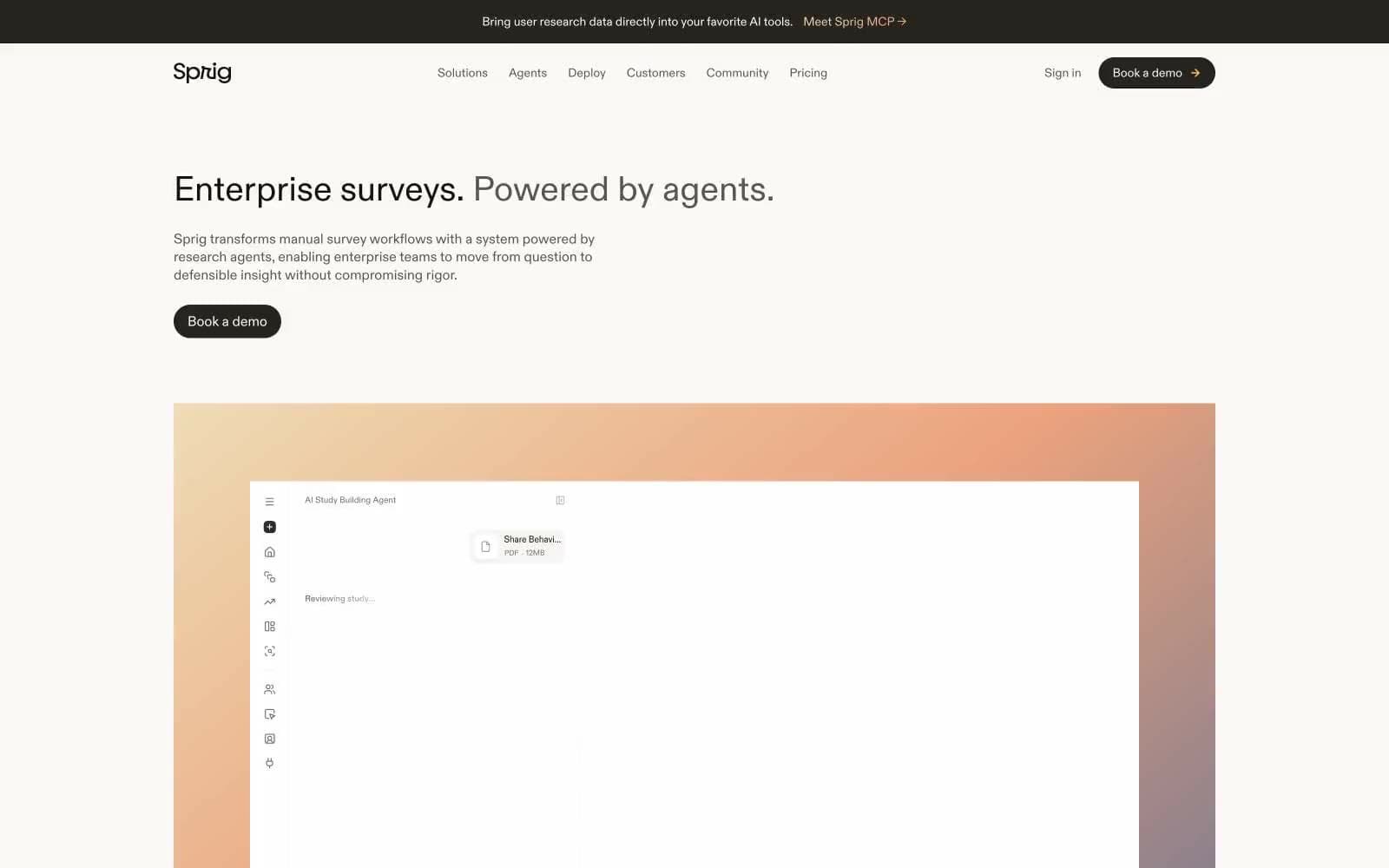
Sprig design system

Accent3
Gradient start — warm golden, the opening tone of the signature sunset gradient
Gradient mid-stop — coral-orange transition in the signature sunset gradient
Gradient end — muted purple-gray closing the sunset gradient
Neutrals14
Absolute dark for SVG fills and the strictest contrast moments — used sparingly where true black is needed
Headings, display text, strong UI fills — slightly warmer than Abyssal, used where headings need a touch more warmth
Primary text, nav links, borders, icon strokes — the workhorse near-black with a whisper of navy. Carries every reading surface in the system
Filled button background (primary action), dark surface sections — the primary CTA color, a warm near-black
Deep dark surface, image borders, the second-darkest fill — used in footer-adjacent surfaces and image frames
Body text, nav borders, link underlines — the mid-neutral for readable secondary information
Tertiary text, subtle borders, icon strokes in secondary contexts
Mid-tone surface fills, pressed button states
Disabled text, placeholder text, very subdued heading accents
Muted body text, subdued metadata, tertiary information
Lightest visible border, ghost button outlines — the quietest edge in the system
Borders, dividers, secondary surface fills — a warm gray that defines edges without drawing attention
Card surfaces, badge backgrounds, subtle elevated panels — the first step up from the canvas
Page canvas, card surfaces, button text on dark fills — a warm off-white, never pure #fff
Try a pairing
Pick any two colors from the palette to check whether text stays readable on top.
Aa
Carbon on Ember
10.01 : 1 contrast
- Body textPasses AA 4.5
- Large textPasses AA 3
- StrictPasses AAA 7























