
Slite. Every surface is cream paper, every accent a single ember-orange stroke.
- SaaS
- Light theme
- 16 colors
- 2 typefaces
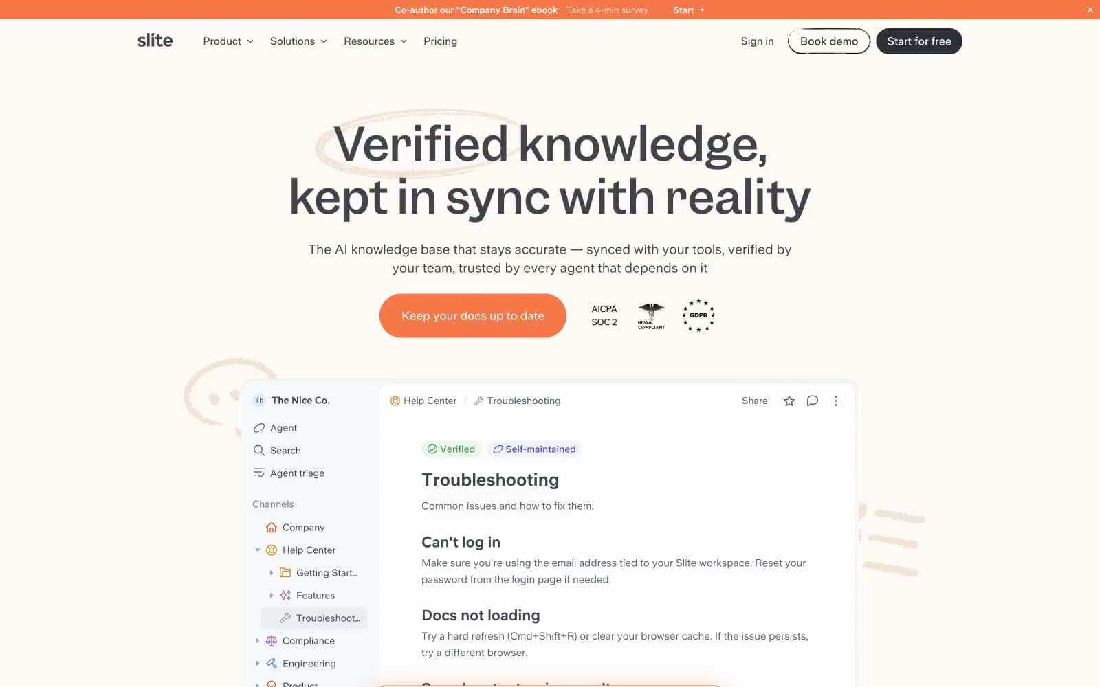
Slite uses a warm-parchment workspace language: the entire page sits on a cream paper canvas (#fdf9f4) rather than cold white, and a single vivid orange (#f67748) acts as ember — appearing only on the primary CTA, selected status pills, and card border highlights. Typography is split between Garnett (a custom serif-feeling display face with tight tracking) for headlines and a custom UniversalSans (geometric humanist) for everything else, giving the page the rhythm of a well-edited document: serif headlines that feel handwritten, sans-serif body that feels like typed notes. Components are pill-heavy and shadow-light: ghost and outlined pill buttons, 32px-rounded feature cards, dust-toned tag chips, and hand-drawn circle annotations around key phrases. The dominant motion is restrained (130ms ease) and the dominant structure is a centered column with comfortable 80–120px section gaps — never information-dense, always breathing.
Slite design system

Brand1
Primary action — filled CTA buttons, selected card border accent, featured testimonial card background, and the scribble-annotation color. The single saturated brand color, used sparingly so it always feels like a deliberate highlight
Accent5
Secondary action accent — used on at most one button per page (e.g. alternating testimonial CTA) and link-text accents. Never the primary CTA
Green text accent for links, tags, and emphasized short phrases. Use as a supporting accent, not as a status color
Green decorative accent for icons, marks, and small graphic details. Use as a supporting accent, not as a status color
Violet text accent for links, tags, and emphasized short phrases. Use as a supporting accent, not as a status color
Decorative illustration fill — light-violet shapes in product mockups, paired with Tag Violet as a tonal pair
Neutrals10
Primary heading and body text — slightly warm near-black. The headline color
Secondary body text, navigation labels, and subdued headings. Do not promote it to the primary CTA color
Tertiary body text, captions, helper copy — the quietest readable gray
Small print and fine print text — pricing footnotes, micro-copy beneath headings
Disabled states, placeholder text, and the lightest non-white neutral — used sparingly on the page
Card borders and stroke at low contrast — slightly bluer than Moon Silver, used when a card edge needs to be felt but not seen
Hairline borders, dividers, and 2px outlined button borders — the only border tone used at full opacity
Secondary surface and tag/chip background — a half-step darker than the canvas. Tag pills, secondary buttons, and warm-emphasis callouts
Page canvas and primary card surface — the warm off-white that defines Slite's identity. Never use cold white #ffffff at the page level
Elevated surfaces — product mockup cards, tooltips, white-product interiors stacked on top of the cream canvas
Try a pairing
Pick any two colors from the palette to check whether text stays readable on top.
Aa
Shade Ink on Ember Orange
4.88 : 1 contrast
- Body textPasses AA 4.5
- Large textPasses AA 3
- StrictFails AAA 7























