
Slack. Aubergine stage with white spotlights.
- SaaS
- Light theme
- 20 colors
- 2 typefaces
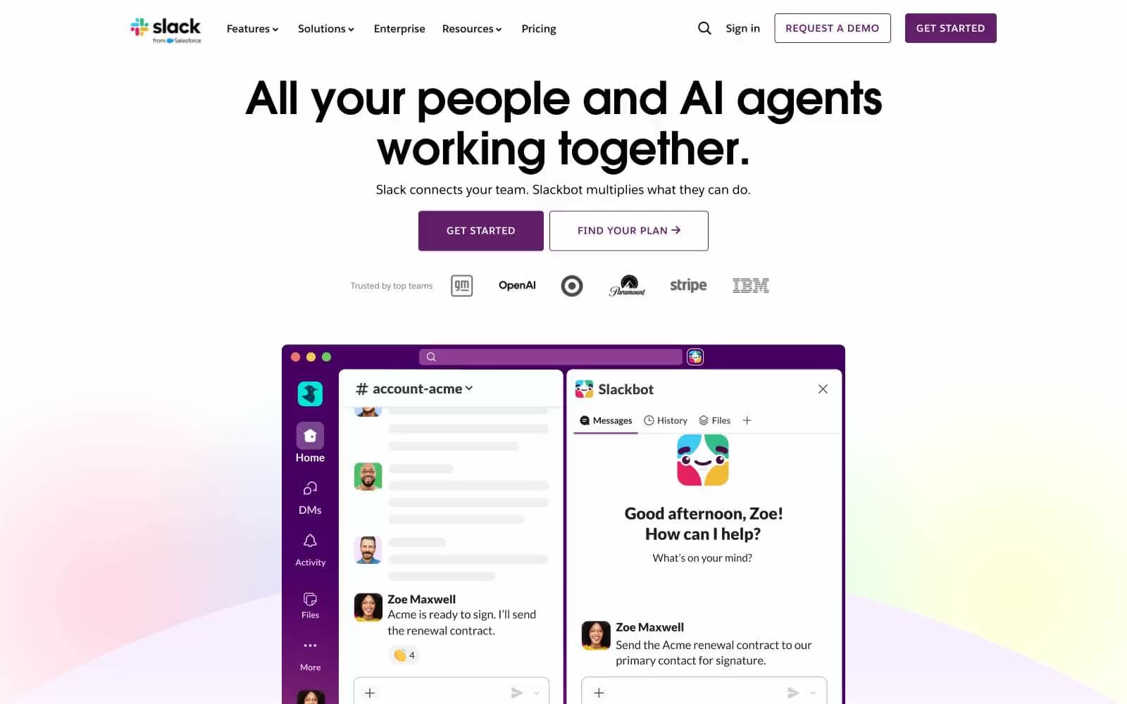
Slack's design language balances a near-white canvas with concentrated pools of aubergine purple — the brand color appears sparingly as CTA fills, dark hero sections, and gradient text highlights while the majority of the page stays airy and monochrome. Type is split into two voices: a geometric display face (Avant-Garde) for oversized headlines at 64-96px, and a humanist sans (Sans) for everything else, keeping body copy at a comfortable 16px. Sections alternate between flat white, faintly lilac washes (#f9f0ff), and fully inverted purple bands, with 16px-radius cards floating over a very subtle 32px ambient shadow. The interface stays quiet so product UI screenshots — rendered in authentic Slack brand chrome — can carry the visual weight.
Slack design system

Brand4
Filled CTA buttons, primary navigation fills, dark hero backgrounds — the brand's signature mid-plum, dense enough to ground without veering black
Largest canvas inversion — full-bleed dark section backgrounds, decorative dark blocks, surface for headline text on white sections
Darker plum for button text and shadow tones on aubergine surfaces — reads as near-black against purple fills
Secondary purple for background fills and link accents — sits between Aubergine and Vivid Violet on the purple ramp
Accent7
Softest lilac wash for body backgrounds, pill fills, and card surfaces — the quiet brand tint that never competes with text
Mid-saturation lavender for card borders, decorative outlines, and pill borders — bridges white and purple without harsh contrast
Headline accent text and gradient text fills on dark sections — the bright punch of color that makes key phrases feel switched on; Diagonal black-to-violet gradient for accent text and decorative text fills on dark sections
Decorative card text and bright accents inside feature cards — a lighter iris that adds lift without losing brand identity
Slack's channel-link blue for in-product references, sidebar highlights, and hyperlink color — appears inside product UI screenshots, not marketing chrome
Blue text accent for links, tags, and emphasized short phrases.
Decorative illustration backgrounds — soft secondary blue used only inside graphic blocks
Neutrals9
Headline text on light sections, icon fills, deepest emphasis — used at display sizes where maximum weight is needed
Primary body and nav text — Slack's near-black that reads warmer than pure #000 at small sizes
Secondary body text, icon fills, muted captions — the middle step between Carbon and Mid Gray
Navigation text, subdued labels, disabled-state text — the working neutral for chrome
Placeholder card backgrounds and neutral fill swatches
Hairline borders, divider lines, subtle 1px separators — the structural neutral that holds cards together
Cool-tinted surface wash for secondary panels and nav highlights
Page canvas — faintly lilac-tinted white that sets the page apart from harsh #fff
Primary surface — card backgrounds, text on dark, pill fills, button text on purple
Try a pairing
Pick any two colors from the palette to check whether text stays readable on top.
Aa
Pure White on Aubergine
11.00 : 1 contrast
- Body textPasses AA 4.5
- Large textPasses AA 3
- StrictPasses AAA 7























