
Seline Analytics. Quiet analyst's desk on warm paper.
- SaaS
- Light theme
- 11 colors
- 2 typefaces
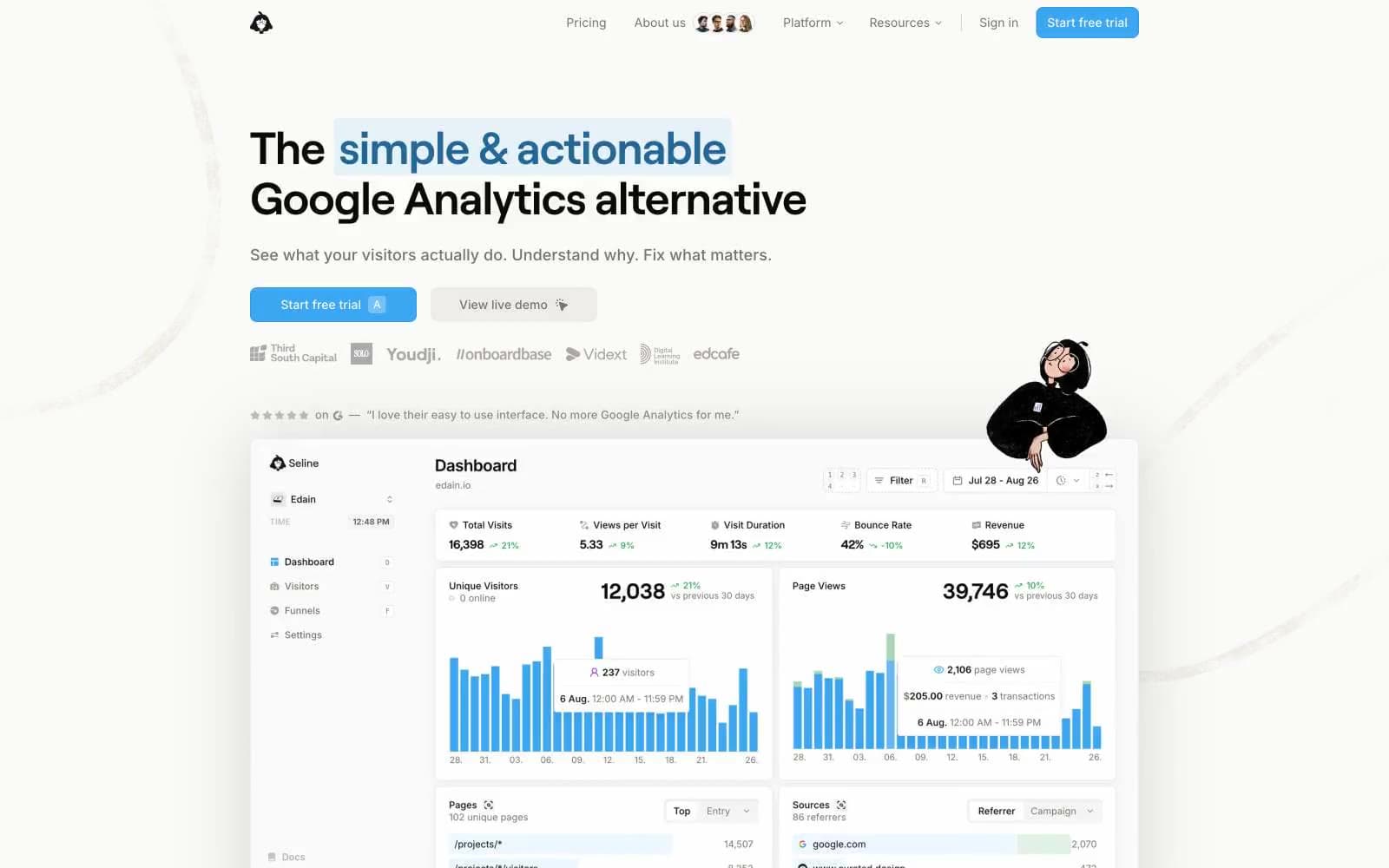
Seline sits on a warm-stone canvas (#fafaf9) with a single vivid cyan as its only chromatic accent — every other color is a neutral pulled from the Tailwind stone scale. Headlines use a custom geometric sans (roobert) at weight 400 with tight negative tracking, giving display copy an unhurried, almost whispered authority that contrasts with the usual SaaS shout. UI surfaces are flat white cards floating over the warm background via a single soft 16px-blur shadow; borders are 1px stone hairlines used generously as the primary structural device instead of heavy dividers or panels. The layout breathes: max-width content centered on generous vertical rhythm, with pill-shaped interactive controls, a mascot sticker illustration for personality, and data dashboard screenshots as proof-of-product. The overall feel is editorial analytics — calm, monochrome, confident — where the blue CTA is the loudest thing on the page by deliberate restraint of everything else.
Seline Analytics design system

Brand2
Primary CTA fill, active links, brand icon strokes — the only chromatic voice on the page, used sparingly to make actions feel switched on
Blue accent for outlined action borders, linked labels, and lightweight interactive emphasis. Do not promote it to the primary CTA color
Accent1
Soft highlight wash behind highlighted text spans, decorative blue tint
Neutrals8
Primary headings, emphasized body, strong icons — near-black with a warm cast
Dark surface backgrounds for inverted sections, dark dashboard tabs
Body text, nav links, secondary copy — warm-tinted neutral that softens body type
Muted helper text, icon strokes, disabled states — readable but recessive
Secondary borders, subtle background tints, decorative separators
Hairline borders on cards, nav, inputs — the primary structural device, not dividers
Page background — warm off-white that reads as paper, not screen-white
Card surfaces, elevated panels, input fills — flat and shadowless by default
Try a pairing
Pick any two colors from the palette to check whether text stays readable on top.
Aa
Ink Black on Cyan Signal
7.44 : 1 contrast
- Body textPasses AA 4.5
- Large textPasses AA 3
- StrictPasses AAA 7























