
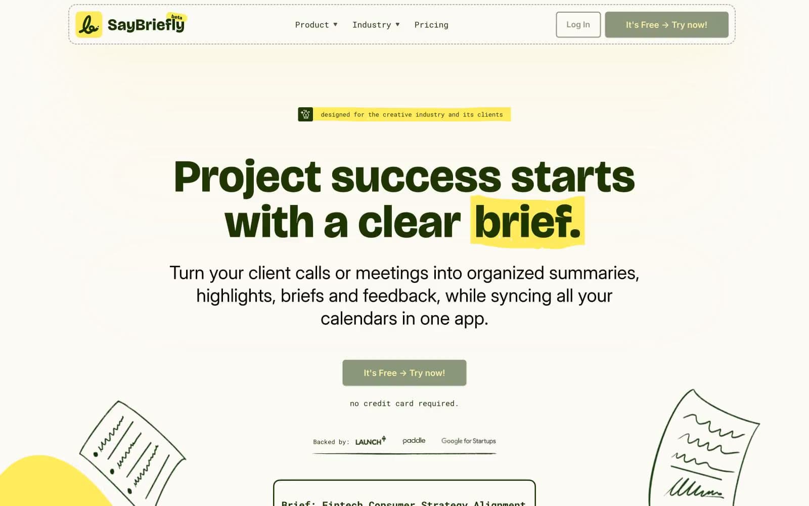
Say Briefly. Creative agency sketchbook on cream paper.
- SaaS
- Light theme
- 9 colors
- 3 typefaces
SayBriefly speaks the visual language of a creative studio's moodboard: warm cream paper, a single deep forest green that does the heavy lifting for text and primary actions, and a vivid school-bus yellow that acts as both highlight marker and playful punctuation. Type is deliberately split-personality — Bricolage Grotesque at extrabold for display headlines with positive tracking that gives the words a sticker-book chunkiness, paired with Inter's clean humanist sans for everything functional. The overall feel is approachable, hand-made, and slightly rebellious: rounded 6px corners everywhere, minimal shadows, scattered pastel accent cards that feel like sticky notes rather than UI cards. Color is rationed — green for structure, yellow for emphasis, and tiny washes of teal/pink/orange as decorative one-offs.
Say Briefly design system

Brand2
Primary text, filled CTA buttons, link text, nav borders, card borders — the structural backbone. This near-black green carries 90% of the interface weight
Text highlight wash (behind keywords in headlines), badge backgrounds, accent fills. Always reads as a marker stroke, never as a CTA
Accent4
Teal action color for filled buttons, selected navigation states, and focused conversion moments.
Green action color for filled buttons, selected navigation states, and focused conversion moments
Decorative button/card fill. Sprinkle use only
Decorative card accent — warm counterpoint to the green/yellow palette
Neutrals3
Nav and divider borders — a single mid-gray for hairlines that should recede
Muted helper text, secondary labels — disappears into the cream canvas
Page canvas, card surfaces, nav background — the warm off-white everything sits on. Slightly yellow-shifted to feel like aged paper, not screen white
Try a pairing
Pick any two colors from the palette to check whether text stays readable on top.
Aa
Cream Paper on Forest Ink
13.27 : 1 contrast
- Body textPasses AA 4.5
- Large textPasses AA 3
- StrictPasses AAA 7























