
Ready. A warm off-white page where a single periwinkle accent marks what matters and everything else recedes.
- SaaS
- Light theme
- 9 colors
- 2 typefaces
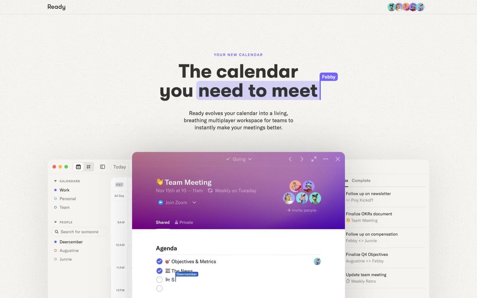
Ready is a light, near-monochrome marketing surface where a single periwinkle violet (#7366fe) does all the chromatic work against warm off-white (#f5f3f2) and near-black text (#333333). The hierarchy is built by two contrasting type families: GT Walsheim 700 at 56-64px with 1.0 leading for headlines, and GT America at 300-500 for everything else, marked by a distinctive 0.167em tracking that gives body copy an open, slightly technical feel. Cards and product mocks sit on generous 32px radii with one soft shadow recipe, creating a gentle floating-above-paper effect rather than hard elevation. The product itself (shown in mocks) shifts into a darker, gradient-rich mode, but the marketing canvas stays quiet and confident — let the product screenshots carry the color drama.
Ready design system

Brand1
Sole chromatic accent — eyebrow labels, active states, icon strokes, link hover, accent borders. The one color that earns attention
Accent2
Secondary violet surface for muted card backgrounds and tonal variety within the violet family
Deepest stop in the product mock gradient (radial fade from #55269c to transparent warm linen) — used only inside product UI mocks, never on the marketing surface
Neutrals6
Primary text, dominant border color — near-black, not pure, softer on the eye
Muted text, placeholder copy, link underlines when unhovered
Mid neutral for muted dividers and secondary structural elements
Soft highlight wash behind inline highlighted phrases in headlines, pale violet surface
Subtle warm surface tint, nav borders, gradient fade-out color — gives the page its paper-like quality
Primary page background, card surfaces inside product mocks
Try a pairing
Pick any two colors from the palette to check whether text stays readable on top.
Aa
#111111 on Periwinkle
4.55 : 1 contrast
- Body textPasses AA 4.5
- Large textPasses AA 3
- StrictFails AAA 7























