
Quin. Warm cream notebook with stamped yellow ink.
- SaaS
- Light theme
- 14 colors
- 3 typefaces
Quin reads like a warm, paper-textured productivity journal — cream canvases, heavy black type, and two accent hues (honey yellow and powder blue) that feel hand-stamped rather than digitally applied. The system is overwhelmingly achromatic; warmth comes from the ivory page color (#fffcf2) and a sandstone neutral palette, not from hue. Hierarchy is built through Instrument Sans at extreme size jumps — 96px display headlines compress to 0.75 line-height with aggressive negative tracking, while body text breathes at 1.5–1.71. Every interface surface sits flat or uses a single hairline border; elevation is implied by tonal shifts in the cream scale, never by drop shadows. Geist Mono with wide positive tracking labels every interactive element, turning nav items, buttons, and badges into typeset stamps rather than chrome.
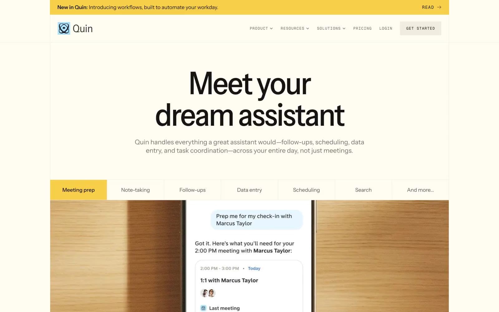
Quin design system

Brand3
Primary brand accent — announcement bar, highlight badges, decorative blocks, the signature warm punctuation against cream
Dark warm accent — button fills in warm contexts, icon borders, tertiary buttons needing chromatic weight
Cool accent — secondary CTA fills, info badges, test card backgrounds, the soft counterpoint to honey yellow
Neutrals11
SVG fills, icon strokes, maximum contrast accents
Primary action fill, strongest text, dominant border color — the visual anchor
Heading text, emphasized body copy, dark surface text
Decorative SVG fills and strokes — vector artwork on dark sections
Body text, link borders, icon color — the workhorse neutral for readable content
Mid-neutral text, icon strokes, secondary borders
Subtle border accent, near-gray for dividers that need to recede
Muted decorative borders and tonal accents where a softer line is needed
Hairline borders, button outlines, nav dividers, card edges
Secondary surface — alternating bands, section dividers, subtle card fills
Primary canvas — page background, card surfaces, light section bands
Try a pairing
Pick any two colors from the palette to check whether text stays readable on top.
Aa
Jet Black on Honey Yellow
13.98 : 1 contrast
- Body textPasses AA 4.5
- Large textPasses AA 3
- StrictPasses AAA 7























