
Qatchup. Ink on warm paper, whispered quietly.
- SaaS
- Light theme
- 11 colors
- 3 typefaces
Qatchup uses a near-achromatic canvas where the only color is emotional: a washed-out grid of gray ink on warm white, with the product almost entirely communicated through type, spacing, and a single handwritten accent. The system is defined by restraint — a custom display sans (Aspekta) set tight with negative tracking, pill-shaped controls, and cards that float on layered hairline shadows rather than colored surfaces. Structure is established by border weight and vertical rhythm, not fills or gradients. A single script typeface (Fasthand) appears sparingly as a human signature — the 'Listen!' above the hero, the 'Open Letter' kicker — creating emotional warmth against an otherwise architectural grid. Components are minimal and ghosted: dark pill buttons for primary action, light pill buttons for secondary, bordered cards for content blocks, and thin dividers carrying the layout's load. The colorful hand-drawn illustration is decorative atmosphere, not a UI token system — the interface itself stays quiet and monochrome.
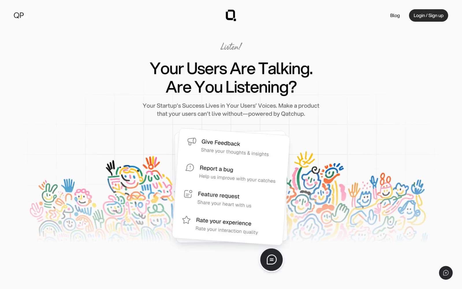
Qatchup design system

Neutrals11
Primary headings, high-emphasis text — the deepest ink against the warm white canvas, anchoring headlines at maximum contrast
Body text, icon strokes, secondary headings — slightly lighter than Charcoal for body density where pure black feels too heavy
Filled button background, dark UI surfaces, strong border emphasis — the primary action surface; charcoal-darker than body text for weight contrast against pills
Default border color, card edges, icon strokes at rest — the structural hairline that carries the entire layout; appears in 260 borderColor uses, making it the most-used stroke in the system
Disabled or inactive border state, decorative dividers — sits between Steel and Fog for tertiary structural lines
Muted secondary borders, low-emphasis dividers — a lighter hairline for de-emphasized structure
Card inner borders, subtle dividers inside containers — softer than Steel for nested elements
Subtle shadow contribution, light card shadow base — a desaturated mid-gray for soft elevation
Image borders, body content dividers, light surface separators — the lightest visible structural line, near-white with just enough definition
Secondary button fill, elevated surface tone, subtle hover state — one step warmer/lighter than Bone for nested surfaces
Page canvas, card surfaces, link border, light text on dark — the warm white foundation; every other neutral reads against this base
Try a pairing
Pick any two colors from the palette to check whether text stays readable on top.
Aa
Bone on Charcoal
19.19 : 1 contrast
- Body textPasses AA 4.5
- Large textPasses AA 3
- StrictPasses AAA 7























