
Qatalog. Ink on paper with two violet sparks.
- SaaS
- Light theme
- 11 colors
- 3 typefaces
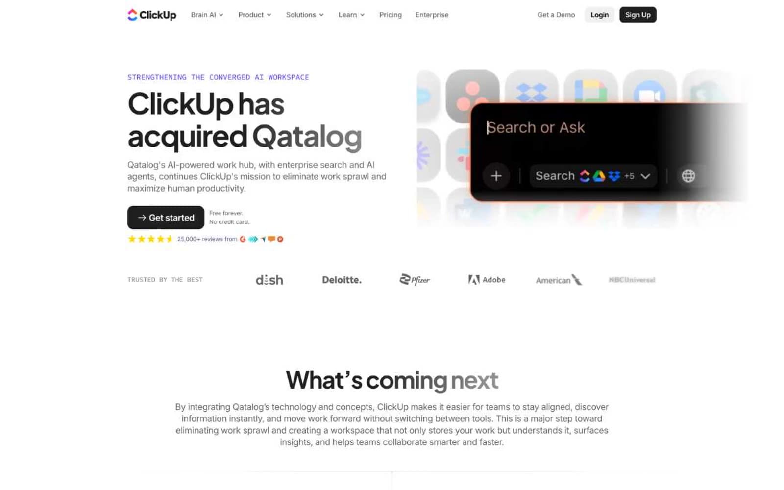
Qatalog operates as a near-monochrome productivity canvas: white background, dark slate ink, and a restrained two-violet accent system that appears as small functional punctuation rather than broad washes. Typography is compact and confident — Plus Jakarta Sans at weights 650-700 carries headlines with tight negative tracking, while Inter handles body and UI chrome at smaller sizes. Surfaces stay flat; depth comes from dark filled cards and 9px radii, never from drop shadows. The single vivid moment is a rainbow gradient that crowns the final dark CTA section, acting as the only chromatic release across an otherwise quiet, architectural layout.
Qatalog design system

Brand2
Primary accent — link text, interactive borders, feature labels, eyebrow text; vivid violet used sparingly as a signal color
Deep accent — section dividers, secondary violet border, paired with Iris for two-tone violet treatments
Accent1
Anchor color of the signature rainbow gradient sweep (with cyan #0091ff and magenta #f100e3)
Neutrals8
Icon fills, pure dark accents, maximum-contrast text on light surfaces
Dark filled button backgrounds, dark card surfaces, deep accent panels
Primary text, dark surface fills, structural borders — cool near-black that reads as the dominant ink across the system
Secondary text, link borders, muted UI chrome — the mid-gray that carries nav, list borders, and body annotations
Muted helper text, badge borders, disabled-state borders
Hairline dividers, subtle surface separation
Subtle surface tint behind nav and ghost buttons
Page canvas, card surfaces, text on dark fills
Try a pairing
Pick any two colors from the palette to check whether text stays readable on top.
Aa
Black on Iris
5.06 : 1 contrast
- Body textPasses AA 4.5
- Large textPasses AA 3
- StrictFails AAA 7























