
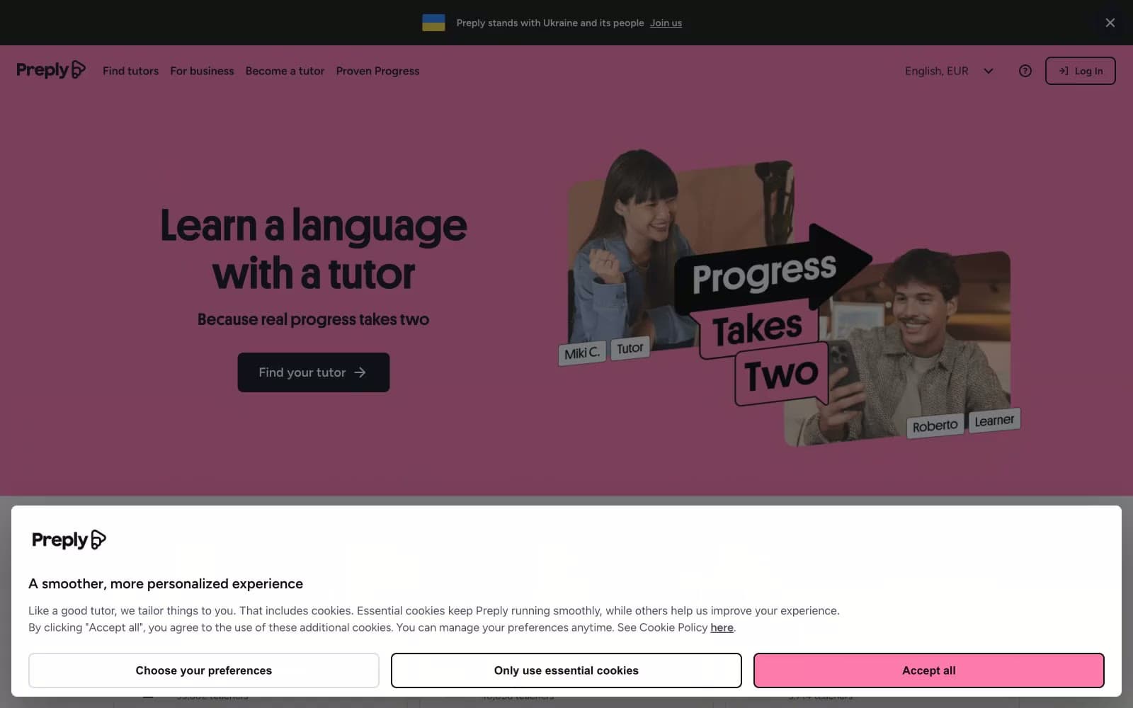
Preply. Pink billboard with human stickers.
- SaaS
- Light theme
- 10 colors
- 2 typefaces
Preply projects a warm, confident energy built on saturated pink hero canvases, near-black typography, and white product surfaces. The visual system is deliberately loud in the top fold to express brand personality, then quiets down into a calm black-and-white catalog of tutors and content once the user moves into functional areas. Platform (a chunky, high-contrast display face) carries all headings at weight 700 with very tight tracking and line-heights, making 48–96px headlines read as solid blocks of voice rather than delicate type. Figtree handles all UI and body text at moderate weights with slightly looser tracking. Components are flat and rectangular — 4px and 8px corners are the only soft edge in the system, and shadows are nearly absent. Photography is integral: real tutor/learner portraits are cropped, slightly rotated, and layered with black text stickers, giving the brand a handmade, scrapbook-like quality that contrasts the structured grid below.
Preply design system

Brand1
Red supporting accent for decorative details and low-frequency emphasis. Do not promote it to the primary CTA color
Accent2
Accent highlights, announcement bar background, decorative stickers — used sparingly as a callout color over pink
Secondary accent, tag chips, and decorative illustration — the cool counterpoint to pink in multicolor compositions
Neutrals7
Icon fills, decorative sticker text, and any place where the absolute black is needed for photographic overlay
Dark supporting neutral for text, icons, and strong contrast. Do not promote it to the primary CTA color
Body copy, icon strokes, secondary text — the readable neutral that lives between Midnight Ink headings and lighter helper text
Card border accent and tertiary text, slightly cooler than Midnight Ink for layered hierarchy
Card borders, input outlines, dividers — structural hairlines that define the catalog grid
Subtle page background for content sections that need separation from pure white
Page canvas above the pink hero, card surfaces, tutor catalog backgrounds, button text on dark fills
Try a pairing
Pick any two colors from the palette to check whether text stays readable on top.
Aa
Pure Black on Preply Pink
8.63 : 1 contrast
- Body textPasses AA 4.5
- Large textPasses AA 3
- StrictPasses AAA 7























