
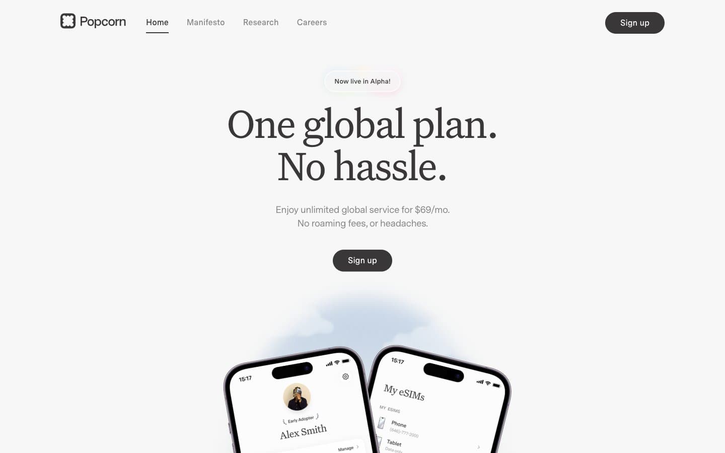
Popcorn. A near-monochrome editorial where a single serif headline does all the emotional work and everything else whispers in warm gray.
- SaaS
- Light theme
- 7 colors
- 2 typefaces
Popcorn operates as a warm editorial-monochrome system: a creamy off-white canvas (#f7f7f7) carries a near-black warm gray for type (#393737) and a dual-font pairing where Untitled Serif at 64–88px acts as broadsheet display and Messina Sans handles every functional role underneath. The two custom typefaces — a high-contrast serif and a humanist sans — create an editorial gravitas rarely seen in telecom, and the aggressive negative tracking on display sizes tightens the headlines into confident blocks rather than decorative flourishes. Color is nearly absent (2% colorfulness); the system relies on scale contrast, tight tracking, and one soft drop shadow (rgba(0,0,0,0.05) 0 4px 20px) to build hierarchy. Interactive elements are uniformly pill-shaped (100px radius) to create a soft humanistic counterpoint to the formal type, while a conic gradient and a lavender testimonial band provide the only chromatic punctuation.
Popcorn design system

Accent2
Testimonial section background. The single chromatic section break — a warm desaturated lavender that signals a different content zone while staying within the muted palette
Decorative conic gradient base — soft mint, sage, sky, cream, blush, lilac orbiting in a 360° conic. Used only as background fill behind feature illustrations, never on UI controls
Neutrals5
Neutral form states, badge text, and quiet UI feedback where color should stay understated. Do not promote it to the primary CTA color
Muted helper text, secondary borders, inactive link text. The mid-tone that separates supporting copy from primary text without introducing color
Soft card surface tint, cool-toned highlight wash. The only chromatic-leaning neutral — used sparingly on informational cards to break the warm cream without breaking the monochrome discipline
Page background, badge fills, soft surface wash. The dominant canvas color — warmer than pure white, gives the serif type a paper-like substrate to sit on
Hairline borders, dividers, input outlines, and card edges on light surfaces.
Try a pairing
Pick any two colors from the palette to check whether text stays readable on top.
Aa
Warm Graphite on Lilac Field
10.49 : 1 contrast
- Body textPasses AA 4.5
- Large textPasses AA 3
- StrictPasses AAA 7























