
Pop Site. Monumental black headlines floating on white walls, with one blue dot of intent.
- SaaS
- Light theme
- 9 colors
- 3 typefaces
Pop Site is a stark typographic gallery: an almost exclusively white canvas where oversized Satoshi display headlines — often 93–120px — carry the entire visual weight. A single vivid blue (#3b82f6) is the only chromatic note in the system, reserved exclusively for primary CTAs, active links, and subtle surface washes; everything else is monochrome grays and blacks at near-maximum contrast. Components are quiet and confident: pill-shaped buttons, hairline borders, softly rounded cards, and phone mockups as hero subjects. The density is airy and editorial, with comfortable spacing between sections and text that breathes. This is a builder site that wants to feel like a product page for the product it helps you build — Apple-adjacent restraint, Linear-grade precision, Carrd-grade simplicity.
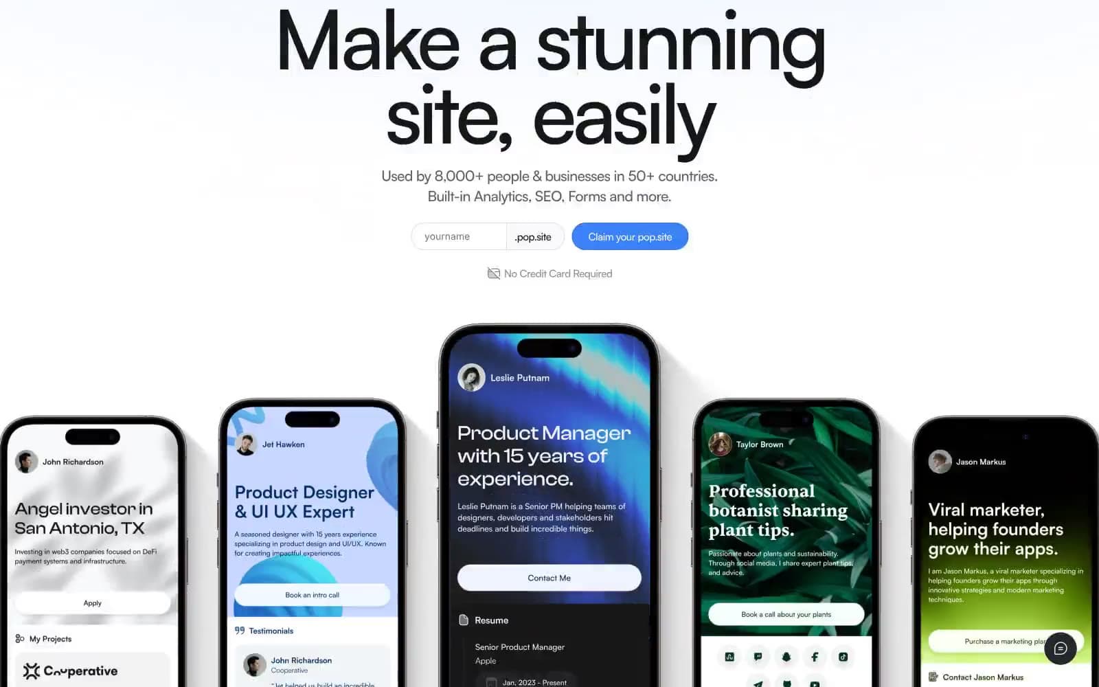
Pop Site design system

Brand2
Primary CTA fills, active link borders, key accent — the only chromatic color allowed to draw the eye
Lighter blue for link text and secondary outlined actions
Accent1
Soft blue surface wash for highlighted sections and subtle backgrounds
Neutrals6
Primary heading text, heavy borders, icon fills, image framing
Body text, nav text, secondary borders — slightly softer than pure black for long-form readability
Muted helper text, secondary descriptions
Tertiary text, disabled states, fine metadata
Hairline dividers, nav accents, light surface variation
Page background, card surfaces, button text on blue
Try a pairing
Pick any two colors from the palette to check whether text stays readable on top.
Aa
Ink Black on Signal Blue
5.71 : 1 contrast
- Body textPasses AA 4.5
- Large textPasses AA 3
- StrictFails AAA 7























