
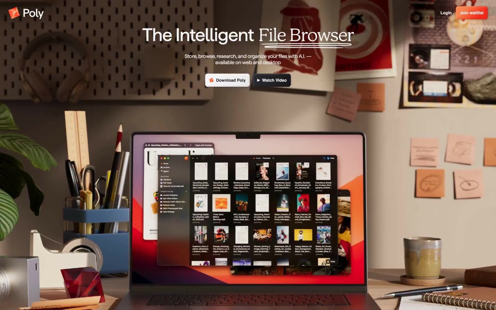
Poly. One warm gradient ember floating on an otherwise pure white editorial page, surrounded by quiet serif headlines and full-bleed photography.
- SaaS
- Light theme
- 5 colors
- 4 typefaces
Poly is editorial software: a warm off-white canvas (#f4f4f4), near-black ink for text and UI, and a single ember-orange-to-red gradient reserved for the brand mark. Photography does the heavy atmospheric lifting — full-bleed desk scenes with natural materials and warm directional light replace illustration and decoration. Display type is a humanist serif (Haffer at 450, with liga and ss04 features) pulled tight at -0.02em, paired with Inter for UI. The system feels restrained the way a magazine spread feels restrained: one chromatic moment, hairline borders instead of shadows, 8px radii everywhere, and a column grid that lets the photography breathe.
Poly design system

Brand1
Brand mark, Poly logo, the sole chromatic accent — warm orange fading to signal red, used only on identity, never on body UI
Neutrals4
Dark borders and separators for elevated surfaces and inverted UI. Do not promote it to the primary CTA color
Secondary text, hairline borders, icon fills, the slight warmth that keeps near-black from feeling clinical
Shadow tone used in the soft-etched link treatment, muted dividers
Page canvas, card surfaces, inverted text on dark photo backgrounds
Try a pairing
Pick any two colors from the palette to check whether text stays readable on top.
Aa
Porcelain on Onyx
19.09 : 1 contrast
- Body textPasses AA 4.5
- Large textPasses AA 3
- StrictPasses AAA 7























