
Playful. Sunlit paper notebook with a hot-pink highlighter.
- SaaS
- Light theme
- 12 colors
- 2 typefaces
Playful reads like a warm, hand-crafted workshop printed on cream paper. The entire surface sits on a sandy oat canvas (#f6f2ee) rather than clinical white, giving every screen a paper-like, approachable warmth. A single hot-pink (#ff2e95) does all the chromatic work — CTAs, links, logo mark — against a near-black ink (#111/#000), so screens stay visually quiet until a moment of action is needed. The display type is unapologetically heavy and italic at 70–79px, leaning into editorial poster energy rather than SaaS neutrality. Components are large and soft: 44px cards on pill-shaped buttons, deep diffused shadows, generous breathing room. The overall rhythm is one bold typographic statement per section, surrounded by quiet warm whitespace.
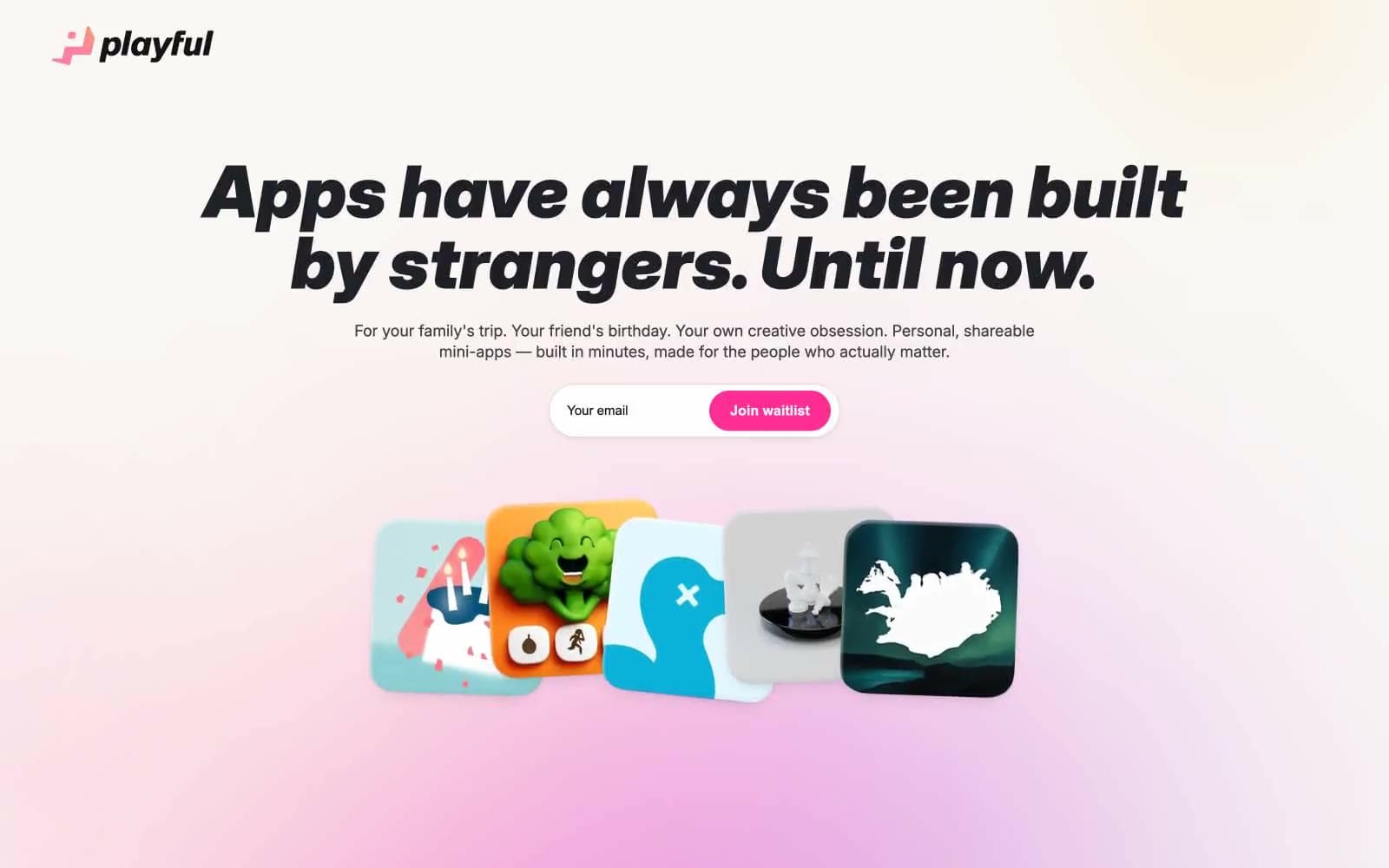
Playful design system

Brand1
Primary CTA fill, logo mark, link color, accent strokes — the only chromatic voice in the system, used sparingly to signal action
Neutrals11
Primary heading text, button text, heavy borders, navigation bar background
Body text and headings on light surfaces, card surface background for dark elements
Secondary text, subtle body copy — a cool near-black used for non-headline text
Deep heading text variant, near-black with subtle cool cast for high-weight headlines
Neutral form states, badge text, and quiet UI feedback where color should stay understated. Do not promote it to the primary CTA color
Icon strokes, muted helper text, subtle UI dividers
Card shadow base tone, muted surface fills
Secondary borders, decorative outlines on warm surfaces
Hairline borders, dividers, subtle container outlines — warm-toned to match canvas
Page background, large surface fills — the warm cream that replaces cold white throughout
Card surfaces, elevated panels, contrast surface against oat canvas
Try a pairing
Pick any two colors from the palette to check whether text stays readable on top.
Aa
Ink Black on Hot Magenta
6.08 : 1 contrast
- Body textPasses AA 4.5
- Large textPasses AA 3
- StrictFails AAA 7























