
Plain. A single living green accent breathing inside a calm cream workspace.
- SaaS
- Light theme
- 9 colors
- 3 typefaces
Plain uses a botanical productivity-canvas language: warm parchment-cream surfaces, a single vivid green accent, and ABC Favorit set with tight negative tracking to create a calm but alive workspace feel. The interface stays quiet and mostly monochromatic — deep forest-black ink on warm off-white — letting the green act as small functional punctuation for primary actions, active states, and notification dots. Components feel like editorial product UI: 6px-rounded buttons, 9px-rounded cards, generous 24-40px breathing room, and product screenshots treated as the hero rather than decorative imagery. Type carries the energy — display headlines at 80px whisper with -0.02em tracking, emoji-embedded headings break the grid playfully, and Geist Mono tags provide quiet metadata rhythm alongside the warm Favorit voice.
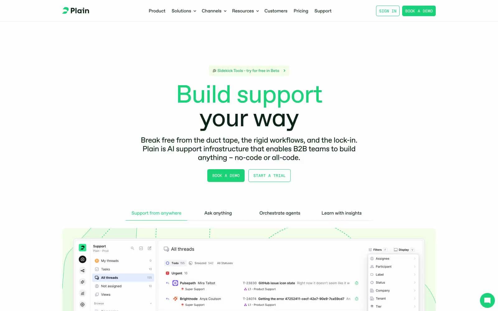
Plain design system

Brand2
Primary action background, active nav state, live notification dots, and the hero brand accent. Vivid botanical green that reads as alive against the cream — this is the only color allowed to shout
Green accent for outlined action borders, linked labels, and lightweight interactive emphasis. Do not promote it to the primary CTA color
Accent2
Red outline accent for tags, dividers, and focused UI edges
Red wash for highlight backgrounds, decorative bands, and soft emphasis behind content.
Neutrals5
Primary text, heading strokes, and structural borders. A near-black with green undertone that grounds the warm cream surfaces in nature rather than corporate gray
Dark elevated surface for hero feature blocks and inverse sections. A muted green-black that ties the dark theme back to the brand green
Secondary helper text, subdued labels, and low-emphasis icons. The bridge between Forest Ink and Sage Charcoal for non-primary copy
Card and elevated surface background. Slightly warmer and more beige than Parchment Cream, creating a paper-grain feel for nested elements
Primary surface for buttons, soft callouts, and section tints. A warm cream with green undertone — the canvas color, not pure white
Try a pairing
Pick any two colors from the palette to check whether text stays readable on top.
Aa
Wine Plum on Vivid Green
9.18 : 1 contrast
- Body textPasses AA 4.5
- Large textPasses AA 3
- StrictPasses AAA 7























