
PencilBooth. Monochrome broadsheet manifesto.
- SaaS
- Light theme
- 9 colors
- 1 typeface
PencilBooth is a monochrome editorial broadsheet: pure white and soft gray surfaces carry the load, with a single deep navy accent reserved exclusively for the active/selected state. The visual system is dominated by typographic architecture — 96px display headlines at weight 700 act as section anchors, while body copy stays compact and dense in a two-column reading grid. The interface reads like a curated print manifesto, not a SaaS dashboard: components are flat, borders are hairlines, and chromatic color appears only as functional punctuation (a highlighted tab, a colored emoji-style icon avatar). Every surface decision prioritizes legibility and quiet hierarchy over visual flourish.
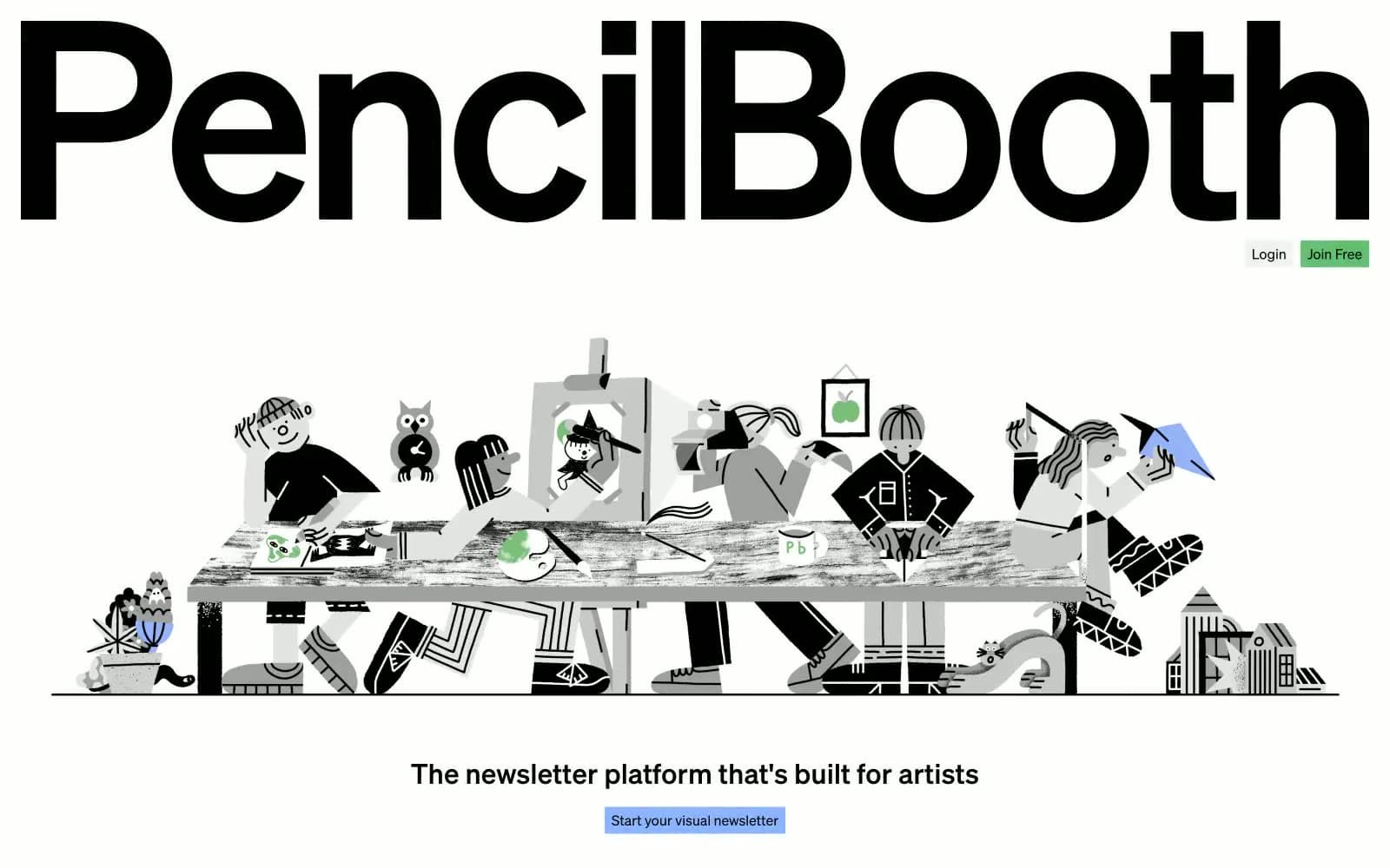
PencilBooth design system

Brand1
Active/selected tab background and the system's sole chromatic accent — appears once per section to signal the current state against the monochrome field
Accent2
Subtle surface wash and decorative highlight — soft chromatic field used sparingly behind small elements, never as a CTA
Soft surface tint — the gentlest chromatic wash for background sections that need to break the achromatic field without competing with content
Neutrals6
Primary text, display headlines, icon strokes — the only true black in the system, used at full strength for headlines and body to maximize contrast against the light canvas
Secondary body text — softened black for long-form copy in the right column, reduces visual weight without sacrificing legibility
Tertiary text and metadata — captions, labels, and supporting copy that should recede behind primary content
Borders, dividers, card outlines, and structural rules — by far the most-used color (4960 occurrences), it defines every interface edge with 1px restraint
Page background and recessed surface — the dominant canvas that makes white cards feel lifted without using shadows
Card surfaces, elevated panels, and inset backgrounds — the bright surface that floats above the canvas gray
Try a pairing
Pick any two colors from the palette to check whether text stays readable on top.
Aa
Paper White on Deep Navy
12.20 : 1 contrast
- Body textPasses AA 4.5
- Large textPasses AA 3
- StrictPasses AAA 7























