
Patreon. A near-blank editorial stage where the only color lives inside the frame.
- SaaS
- Light theme
- 8 colors
- 1 typeface
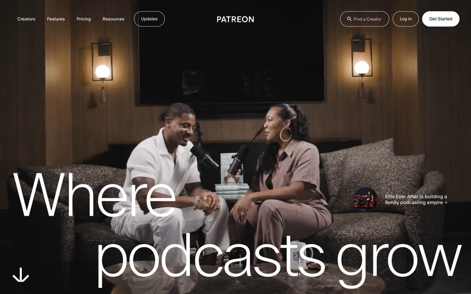
Patreon is an editorial-monochrome platform: a near-pure white canvas where the only color is photographic. The UI recedes so creator portraits can dominate. The custom 'Oracle' typeface is set in whisper-light weights (250–350) with aggressively tight negative tracking, producing a high-fashion magazine tone rather than a typical SaaS register. Buttons and inputs are pill-shaped (30–45px radii), borders are hairline #1a1a1a, and the single filled action is pure black — no chromatic brand color, no gradients, no decorative tint. The system is deliberately austere: the visual richness comes from real human photography, not from interface ornament.
Patreon design system

Brand1
Deep navy from the logo wordmark and highest-contrast brand moments. The darkest chromatic in the system, reserved for brand identity and the cookie banner link text
Accent2
Soft blue-washed section background visible behind the creator-photo carousel. Functions as a breathing tonal band between the pure-white canvas and photographic blocks — never used on UI controls
Violet wash for highlight backgrounds, decorative bands, and soft emphasis behind content. Do not promote it to the primary CTA color
Neutrals5
High-contrast neutral action fill for primary buttons on light surfaces.
Primary text, hairline borders, subtle dividers — used at very-high frequency (1452 instances) across body, list, card, and input borders. The near-black rather than pure #000 keeps the UI from feeling harsh while preserving the monochromatic authority
Warm-tinted neutral appearing in hero overlays and photographic edges. Subtly breaks the otherwise cool monochrome with an organic warmth pulled from creator imagery
Mid-tone neutral for secondary text, muted metadata, disabled states. Bridges the gap between #1a1a1a and white for hierarchical de-emphasis
Page canvas, card surfaces, button text on dark fills, input fields. The base layer everything else floats on
Try a pairing
Pick any two colors from the palette to check whether text stays readable on top.
Aa
Paper on Brand Blue
14.30 : 1 contrast
- Body textPasses AA 4.5
- Large textPasses AA 3
- StrictPasses AAA 7























