
Patch. Electric blueprint on drafting paper.
- SaaS
- Light theme
- 8 colors
- 2 typefaces
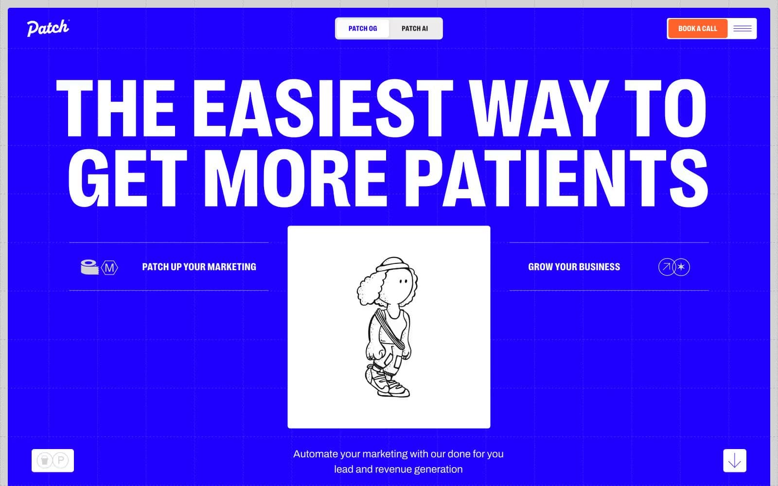
Patch uses a loud, electric-blue blueprint aesthetic: a vivid indigo canvas (#1f00ff) alternates with stark white cards, and every interface element either lives inside a crisp hairline border or against the full-bleed blue. Typography is aggressive and condensed — PP Right at weight 800 with sub-1.0 line heights makes headlines feel architectural rather than friendly, while Archivo keeps body text quiet and functional. A single warm orange (#ff622b) punctures the blue/white duopoly as the only fill color used for primary actions. Hand-drawn line illustrations (sketchy people, objects) sit centered inside white cards, reinforcing a 'marketing blueprint' mood. The overall feel is a confident, slightly retro-tech agency identity — medical marketing pitched as engineering, not healthcare.
Patch design system

Brand1
Full-bleed hero canvas, section backgrounds, heading text on light surfaces, all primary borders and dividers — the single chromatic color that defines the entire system
Accent1
Filled CTA buttons and active nav markers — the only warm color, reserved exclusively for conversion moments
Neutrals6
Primary body text, dark card backgrounds, button borders — near-black with a slight warmth
Major section dividers, muted heading accents, structural borders on the blue canvas
Input backgrounds, hairline borders on light sections, disabled states
Secondary card surfaces, subtle elevation between cards and canvas
Tertiary card backgrounds, muted surface layer
Page canvas, hero reverse text, card surfaces, icon fills — the neutral that makes the indigo vibrate
Try a pairing
Pick any two colors from the palette to check whether text stays readable on top.
Aa
Pure White on Electric Indigo
8.39 : 1 contrast
- Body textPasses AA 4.5
- Large textPasses AA 3
- StrictPasses AAA 7























