
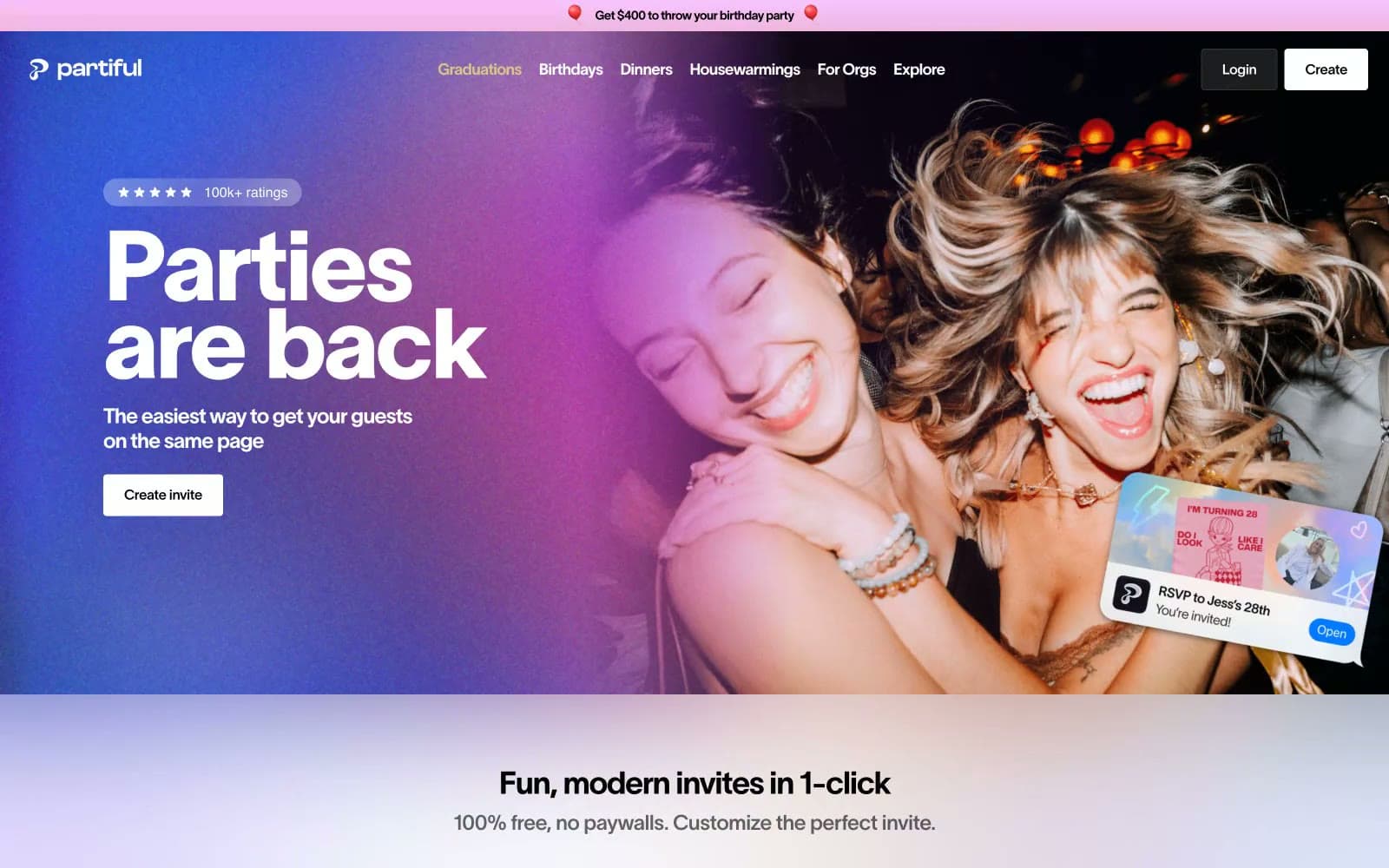
Partiful. The page stays quiet and light while the content explodes with color and celebration.
- SaaS
- Light theme
- 12 colors
- 12 typefaces
Partiful runs on celebration energy: a white canvas that gives way to full-bleed photographic heroes washed in purple-to-pink gradients, then returns to white for feature sections with soft periwinkle-to-white gradient backgrounds. The type system pairs a custom display face (Partiful Display Medium) for statement headlines — used at sizes up to 112px with tight -0.03em tracking — with TWK Lausanne Pan across all weights for UI text, giving the whole interface a confident, slightly editorial quality. Black is the primary action color: filled black buttons, black borders, black headings — no blue accent, just pure contrast. Decorative depth comes from invitation card imagery, scattered at tilted angles against gradient washes, making the UI feel like a physical party surface rather than a software dashboard.
Partiful design system

Brand1
Primary text, filled CTA buttons, icon fills, card borders — black on white is the entire contrast system; no blue or colored accent dilutes it
Accent5
Active nav item highlight text — the single warm accent in an otherwise achromatic nav bar
Hero gradient start — soft pink-violet wash over photography
Section gradient accent — soft blue tint fading to white for feature-section backgrounds
Decorative surface gradient — teal-to-pale wash used in invitation card previews
Deep brand accent in invitation templates and decorative event card designs
Neutrals6
Secondary body text, footer links, supporting labels
Tertiary body copy, descriptive paragraphs, helper text in feature sections
Muted captions, attribution text, ratings sub-labels
Footer section headings, disabled labels
Hairline borders, disabled button backgrounds
Page background, card surfaces, button text on dark backgrounds, nav surfaces
Try a pairing
Pick any two colors from the palette to check whether text stays readable on top.
Aa
Pure Canvas on Midnight Ink
21.00 : 1 contrast
- Body textPasses AA 4.5
- Large textPasses AA 3
- StrictPasses AAA 7























