
Parallel. Warm editorial atelier.
- SaaS
- Light theme
- 10 colors
- 2 typefaces
Parallel operates as a warm editorial atelier: a cream-paper canvas (#e4dfd9) hosts product surfaces in white, photography is presented in full-bleed cinematic crops with deep blacks and amber-warm lighting, and the only chromatic punctuation is a small ember-orange dot that marks emphasis. Typography carries a dual-register system — a weight-500 editorial display face (Rules Font) for headlines and a neutral system sans-serif for everything functional — letting headings feel hand-set while the UI stays quiet and utility-driven. Components are physically restrained: 20px card radii, 8-12px button radii, hairline #c7c7c7 dividers, a single soft shadow for elevation, and pill-shaped toggles. The design vocabulary is closer to a magazine layout than a SaaS dashboard — generous breathing room, aligned text blocks, and photography treated as the hero, not the accent.
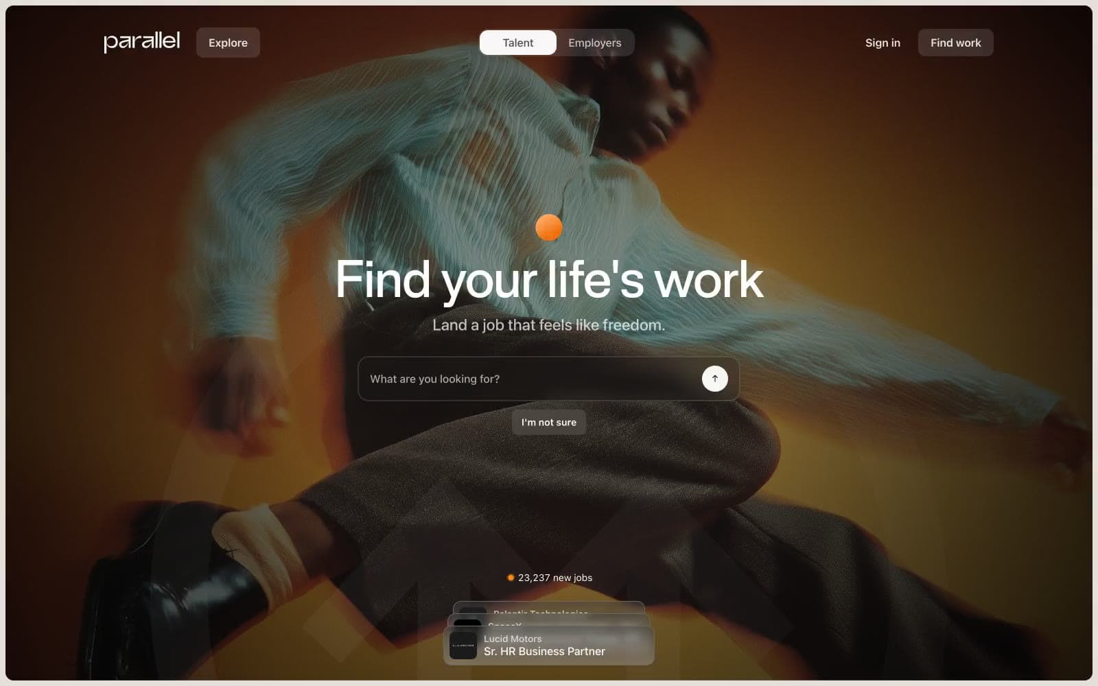
Parallel design system

Neutrals10
Primary text, strong borders, icon strokes, logo wordmark — the maximum-contrast voice
Body text and heading color for subtle warmth below pure black
Filled button backgrounds, dark UI surfaces, photo overlay scrims
Dark borders and separators for elevated surfaces and inverted UI. Do not promote it to the primary CTA color
Hairline borders on low-emphasis elements, dividers
Secondary text, subtle heading borders, metadata — the 60% voice
Muted body text, caption-level copy, placeholder text
Hairline borders, subtle dividers, ghost outlines — the most frequent border color in the system
Page background canvas, hero overlays, editorial section backdrops — the warm off-white that sets the entire system apart from generic SaaS grays
Card surfaces, product UI mockups, input fields, text on dark photography
Try a pairing
Pick any two colors from the palette to check whether text stays readable on top.
Aa
Pure White on Charcoal Ink
21.00 : 1 contrast
- Body textPasses AA 4.5
- Large textPasses AA 3
- StrictPasses AAA 7























