
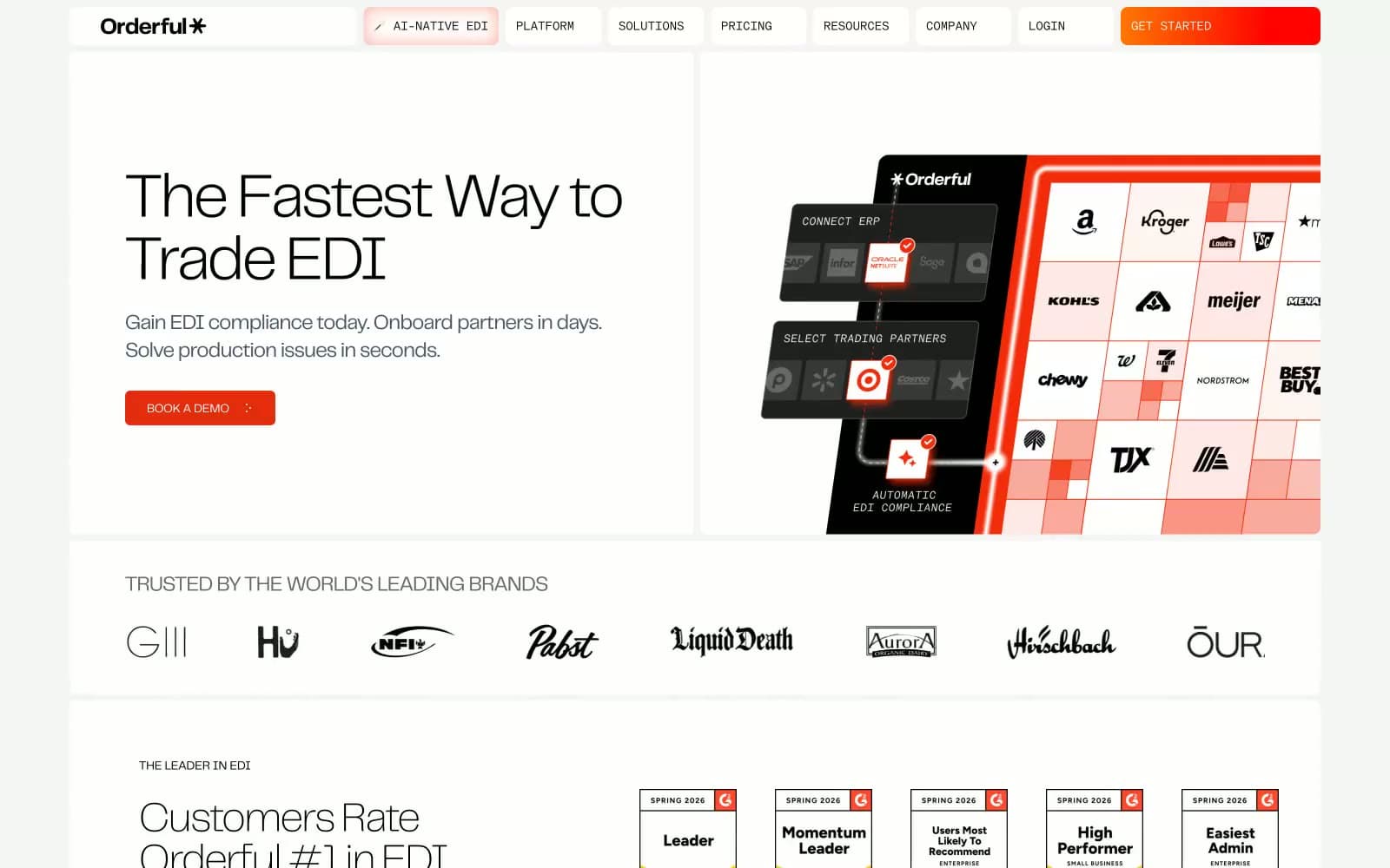
Orderful. A logistics dispatcher's printed control sheet in black ink and surgical vermillion, every page restrained enough to let a single CTA shout.
- SaaS
- Light theme
- 13 colors
- 2 typefaces
Orderful reads as an industrial command deck: a near-pure achromatic surface where black-and-white typography and 8px radii meet a single surgical vermillion accent that punctuates actions rather than decorates. The typographic voice belongs to telegraf, a custom grotesk spanning weights 100–700 and sizes 12–72px, tightened with −0.025em to −0.03em tracking on display and expanded 0.025em on uppercase eyebrows, with modernGothic at 14px/300 handling a specific small-text register via the ss02 alternate. Geometry is disciplined — one universal 8px radius, one two-layer shadow stack used sparingly, and a base 8px spacing scale that breathes at 40–64px section gaps. The result is a calm, information-rich B2B surface that treats color as a scarce commodity: most screens stay monochrome, letting the single red-orange mark function as the only signal that something is actionable.
Orderful design system

Brand1
Orange action color for filled buttons, selected navigation states, and focused conversion moments.
Neutrals12
Hairline borders, logo marks, high-contrast icon strokes, strong body emphasis
Display and heading text, hero headlines — the dominant typographic color
Dark card backgrounds, inverted feature panels, footer surface
Navigation text, active nav items, secondary headings
Body copy, sub-text, icon strokes, eyebrow labels
Subdued heading text, testimonial attributions
Tertiary helper text, decorative dividers
Icon borders, muted labels, disabled states
Button borders, input borders, section dividers
Card hairline borders, subtle container edges
Primary page canvas and white card surfaces.
Card surfaces, button text on dark fills, primary content canvas
Try a pairing
Pick any two colors from the palette to check whether text stays readable on top.
Aa
Paper on Ink Black
21.00 : 1 contrast
- Body textPasses AA 4.5
- Large textPasses AA 3
- StrictPasses AAA 7























