
Operate. Botanist's data terminal.
- SaaS
- Light theme
- 13 colors
- 3 typefaces
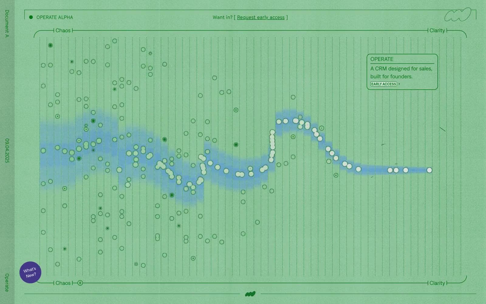
Operate reads like a research instrument placed on a herbarium paper: a muted green-gray canvas hosts data plots, dotted timelines, and axis-labeled diagrams as if the page itself were a botanical scatter chart. Typography is small-set and tight-tracked, with one decorative all-caps face (cinetype) reserved for axis labels, tags, and metadata — the effect is scientific, not promotional. Color is almost entirely a mono-green family: dark forest text on a sage paper background, with a single soft mint (#85c093) for the only filled action and occasional deep-emerald (#007010) for links and borders. Components are flat and hairlined: 4px and 12px radii, 0.5px inset borders instead of drop shadows, and almost no elevation. Density is compact and information-first — the page behaves like a control panel where whitespace is a measured gap, not a luxury.
Operate design system

Brand4
The single filled action color — primary buttons, active state fills, and the rare chromatic surface. A soft, slightly desaturated mint that does not shout against the sage canvas
Green text accent for links, tags, and emphasized short phrases. Do not promote it to the primary CTA color
Green text accent for links, tags, and emphasized short phrases. Do not promote it to the primary CTA color
Alternate data-mark fill and emphasis backgrounds, used on scatter plot points and callout chips
Accent1
A single chromatic exception — used on one special link or annotation to break the green-only system. Employ rarely; treat as a punctuation mark, not a palette member
Neutrals8
Deep text, heavy borders, and dark surface blocks. Slightly warm-neutral, used for the rare dark panel and strong dividers
Primary text, icons, and chart strokes — the load-bearing dark color. Reads near-black but carries a cool green undertone that ties the monochrome system together
Secondary metadata, icon strokes, and caption text where the body tone is too heavy
Soft fill washes, scatter plot halos, and decorative surface tints that sit behind darker data marks
Hairline borders, dotted gridlines, and chart axes. The structural line color when a neutral needs to be present without competing with text
Page canvas and large background fields. A green-tinted light gray that gives the whole surface its herbarium character
Alternate surface tone for nested blocks, inset panels, and subtle differentiation beneath cards
Card surfaces, data point fills, and reverse text on dark blocks
Try a pairing
Pick any two colors from the palette to check whether text stays readable on top.
Aa
Charcoal Bark on Moss
7.48 : 1 contrast
- Body textPasses AA 4.5
- Large textPasses AA 3
- StrictPasses AAA 7























