
OpenWeb. Editorial broadsheet on warm rose paper.
- SaaS
- Light theme
- 5 colors
- 2 typefaces
OpenWeb reads like an editorial broadsheet printed on warm rose paper: a single blush canvas (#f1e9e7), nearly all-black type set in a sharp transitional serif, and one vivid electric blue as the only chromatic accent. The interface is almost entirely typographic — no card shadows, no panel borders, no decorative dividers — letting huge serif headlines at 70–90px with aggressively tight negative tracking do all the structural work. Black filled buttons and ghost blue links provide the only UI punctuation; everything else is whitespace, line breaks, and the warm paper tone. The mood is literary and considered, not app-like; pages feel closer to a magazine spread than a SaaS dashboard.
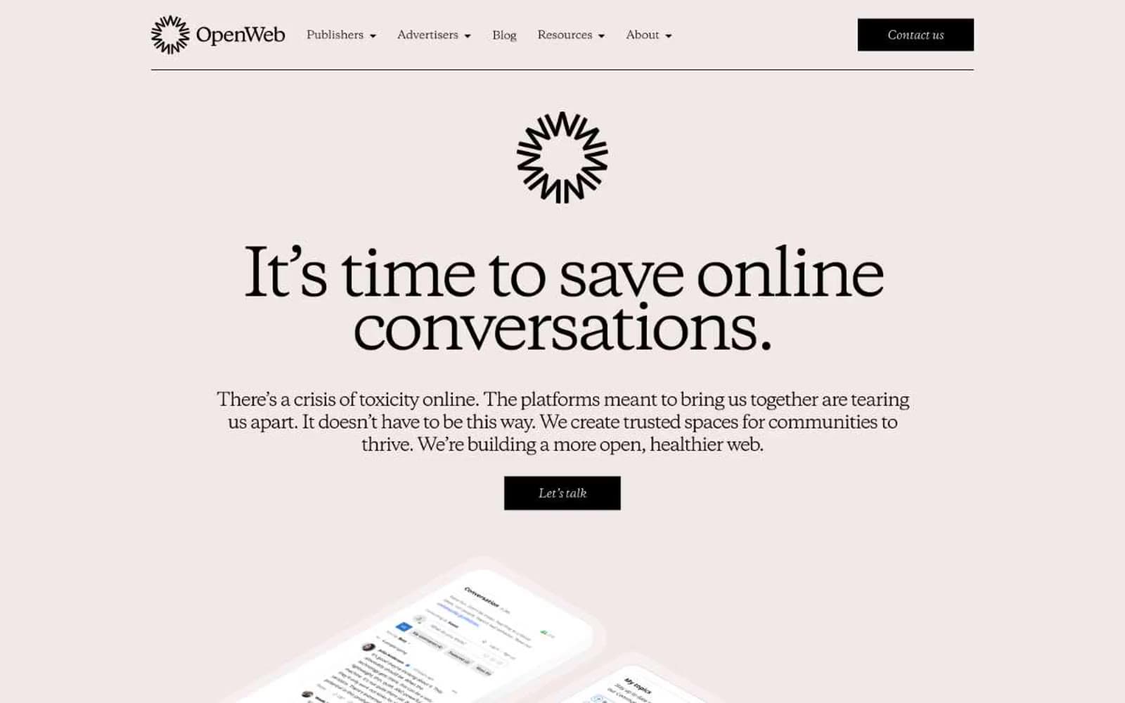
OpenWeb design system

Brand1
Violet accent for outlined action borders, linked labels, and lightweight interactive emphasis.
Neutrals4
Primary text, filled buttons, all iconography, form labels, footer rules. The dominant non-canvas color — drives every typographic and interactive element
Muted helper text, secondary metadata, subdued form placeholder tones. The only neutral that softens Carbon Ink for non-primary copy
Page canvas, all section backgrounds — the warm rose-tinted ground that gives the entire site its editorial, printed-on-paper feel. Never a flat white, never a cool gray
Text color inside filled black buttons, reverse-fill surfaces, and form input contrast. Used sparingly as the counter-tone to Carbon Ink
Try a pairing
Pick any two colors from the palette to check whether text stays readable on top.
Aa
Bone White on Signal Blue
5.49 : 1 contrast
- Body textPasses AA 4.5
- Large textPasses AA 3
- StrictFails AAA 7























