
Officevibe. Editorial journal on warm cream paper.
- SaaS
- Light theme
- 10 colors
- 3 typefaces
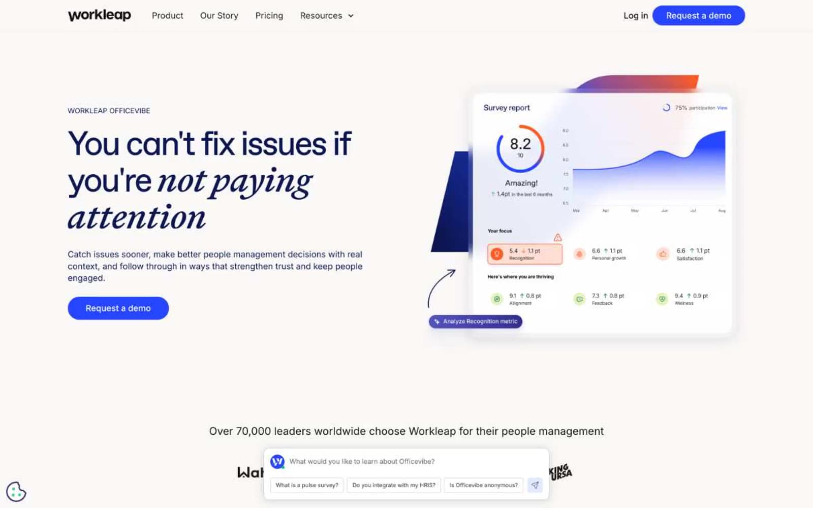
Workleap Officevibe speaks in a calm editorial register: a warm cream canvas, generous whitespace, and serif display type that lends the product a literary, almost handwritten authority. The palette pivots between two blues — a deep ink-navy for headings, dark cards, and editorial weight, and a vivid electric blue reserved for buttons and interactive punctuation. Surfaces are paper-soft with cream borders rather than gray; corners are gently rounded (16px cards, 100px pill buttons). The italicized serif words inside otherwise sans-serif headlines ("not paying attention", "Everything") are the signature: they break the corporate SaaS voice and make the interface feel like a well-edited magazine. Density stays comfortable; the chat widget anchored at the bottom of every screen is part of the identity, not an afterthought.
Officevibe design system

Brand2
Display headings, dark feature cards, footer background, body text on light canvas — the editorial weight color, used wherever the page needs to feel considered rather than decorative
Violet supporting accent for decorative details and low-frequency emphasis. Do not promote it to the primary CTA color
Accent1
Tinted badge backgrounds, soft highlight washes on white surfaces — a whisper of the electric blue
Neutrals7
Primary body and heading text, nav text, icon strokes on light surfaces
Secondary text, button text in outlined/ghost states, nav inactive labels
Muted helper text, placeholder content, tertiary metadata
Input borders, disabled form states, neutral dividers on white
Hairline dividers, card borders, subtle section separators — replaces the typical cool gray to keep the page warm
Page background, footer surface, soft card fills, input backgrounds — the unifying warm off-white
Elevated card surfaces, button text, nav background, input fields, icon fills on dark
Try a pairing
Pick any two colors from the palette to check whether text stays readable on top.
Aa
Paper White on Ink Navy
16.58 : 1 contrast
- Body textPasses AA 4.5
- Large textPasses AA 3
- StrictPasses AAA 7























