
NEVERHACK. Encrypted command terminal on cold marble.
- SaaS
- Light theme
- 13 colors
- 1 typeface
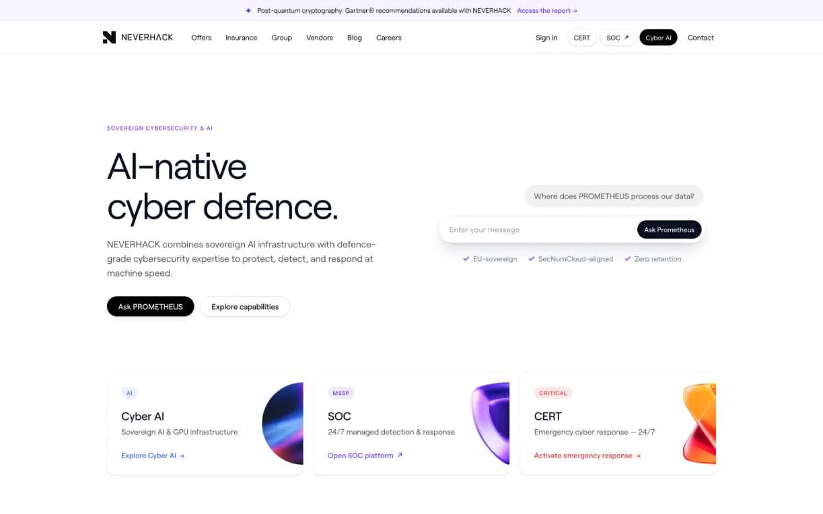
NEVERHACK operates in a stark, high-trust sovereign-cybersecurity register: near-white canvas, near-black navy type (#0a0f1f), and a single electric violet (#6b2bea) that activates only for AI surface. Hierarchy is carved through weight and scale, not decoration — the 72px display headlines paired with a quiet 11–17px body voice create a clinical, operator-grade tension. Components feel like equipment, not marketing: pill-shaped controls, hairline borders on cool gray (#e5e7eb), and a distinctive purple-tinted shadow system (rgba(40,30,93,*)) that makes every elevated surface feel on-brand rather than generic. A muted signal red (#dc2626) is reserved exclusively for critical/emergency semantics — CERT, crisis, hazard — so it never gets confused with the violet brand voice.
NEVERHACK design system

Brand1
Brand accent, AI surface highlights, chat response fills, decorative strokes, badge dots, icon accents — defines the AI-native identity; Hero section ambient gradient: fades from a 6%-opacity violet into Mist Surface, signaling AI atmosphere without hard color blocking
Accent3
Tinted backgrounds for AI-adjacent surfaces, soft highlight washes, capability tags
Blue wash for highlight backgrounds, decorative bands, and soft emphasis behind content. Do not promote it to the primary CTA color
Red supporting accent for decorative details and low-frequency emphasis. Use as a supporting accent, not as a status color
Neutrals7
Primary text, headlines, nav, core UI — near-black with a barely-perceptible blue cast that separates it from pure black and lets violet accents feel native
Secondary text, supporting copy, muted labels
Button shadow tint, disabled affordances, tertiary text
Card inset shadow tint, quiet elevation layer
Borders, dividers, input outlines, structural separators — the single neutral that holds the whole UI together
Page canvas, soft card backgrounds, subtle wash sections
Card surfaces, elevated panels, button text on dark fills
semantic2
Critical/emergency state only — CERT badges, crisis CTAs, hazard indicators. Never used decoratively; its scarcity is its meaning; Radial emergency glow behind critical badges — 22% opacity at upper-right, fading to transparent
Informational badges, neutral data callouts, non-critical status indicators
Try a pairing
Pick any two colors from the palette to check whether text stays readable on top.
Aa
Sovereign Ink on Violet Wash
9.01 : 1 contrast
- Body textPasses AA 4.5
- Large textPasses AA 3
- StrictPasses AAA 7























