
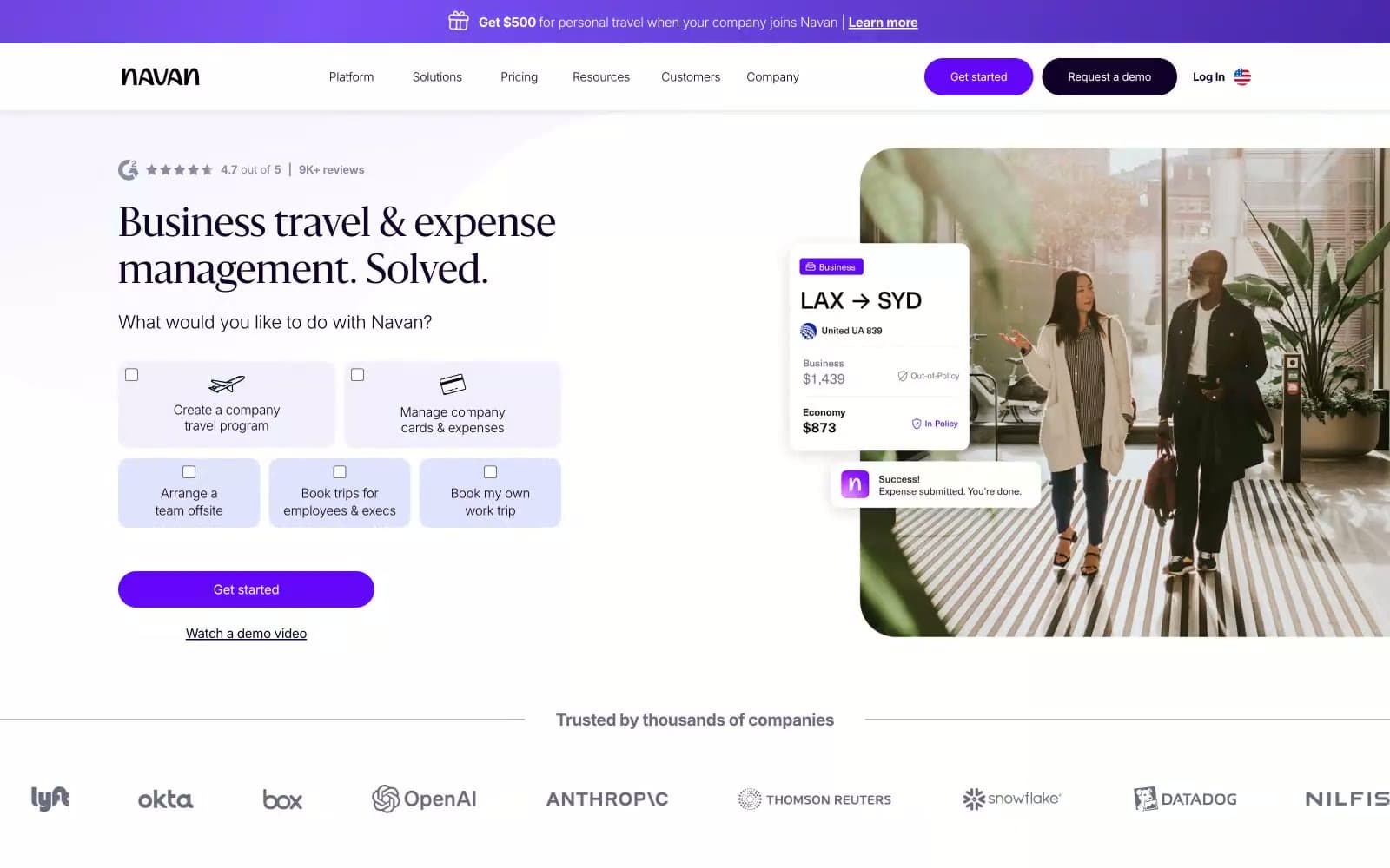
Navan. A quiet, premium travel interior lit by a single signature violet glow.
- SaaS
- Light theme
- 14 colors
- 5 typefaces
Navan operates a premium travel-portal visual language: a near-black violet (#15002c) anchors dark surfaces and text, while a single vivid violet (#6307f8) punctuates primary actions and brand moments. White and off-white surfaces dominate, giving the interface the airy feel of a business-class lounge, with editorial Sanomat serifs for headlines and neutral Neue Hass Grotesk for everything else. Components are light-touch: 14px radii on cards and buttons, pill-shaped CTAs, soft violet-tinted highlight cards, and atmospheric gradient washes that introduce the brand violet without flooding the page. The footer flips to a full-bleed deep-violet band, creating a bookend effect that reinforces the brand color as a destination rather than a decoration.
Navan design system

Brand2
Footer background, primary text on light surfaces, heading color, dark card surfaces — the near-black violet that carries Navan's brand weight across all dark regions and high-emphasis text
Violet supporting accent for decorative details and low-frequency emphasis. Do not promote it to the primary CTA color
Accent3
Soft highlight wash, light accent surface, decorative tag fill — the barely-there violet tint that signals brand presence on neutral cards
Mid-stop in atmospheric brand gradients — bridges deep iris and rose highlights in hero washes; Horizontal brand gradient wash — violet to rose light streak used as a decorative band
Deep gradient origin for atmospheric hero washes — the darkest stop in radial brand gradients
Neutrals9
High-contrast text, icon fills, logo wordmark
Primary text, icon strokes, dark UI text — the body and heading ink
Muted body text, secondary borders, supporting icon strokes
Secondary text, metadata, low-emphasis labels
Tertiary text, caption labels, inactive placeholders
Hairline dividers, card borders, input borders — the universal separator
Page background, nav background, surface wash — the cool off-white that sets the overall canvas
Elevated card surface, subtle panel background — sits one step above canvas
Card surfaces, button text, inverted text on dark fills, badge text
Try a pairing
Pick any two colors from the palette to check whether text stays readable on top.
Aa
Pure White on Deep Iris
19.66 : 1 contrast
- Body textPasses AA 4.5
- Large textPasses AA 3
- StrictPasses AAA 7























