
Monad. Editorial tech journal on warm parchment.
- SaaS
- Light theme
- 13 colors
- 3 typefaces
Monad renders its entire interface on a warm parchment canvas (#f6f3f1) that immediately separates it from the typical pure-white SaaS template. Headlines carry editorial weight in Untitled Serif at weight 400 — never bold — while every body, nav, and UI string runs in ABC Diatype Mono, giving the site the texture of a technical manual typeset for a literary magazine. A single vivid Lake Blue (#2b59d1) is the only chromatic accent for primary actions; everything else lives in a warm grayscale, so a periwinkle card surface (#cfdaf5) and soft pastel gradient washes (coral, sky, mint, gold) read as deliberate punctuation rather than noise. Components lean on hairline borders and 100px pill containers rather than shadows, and the rhythm stays calm and spacious with 40px card padding and generous vertical breathing room between sections.
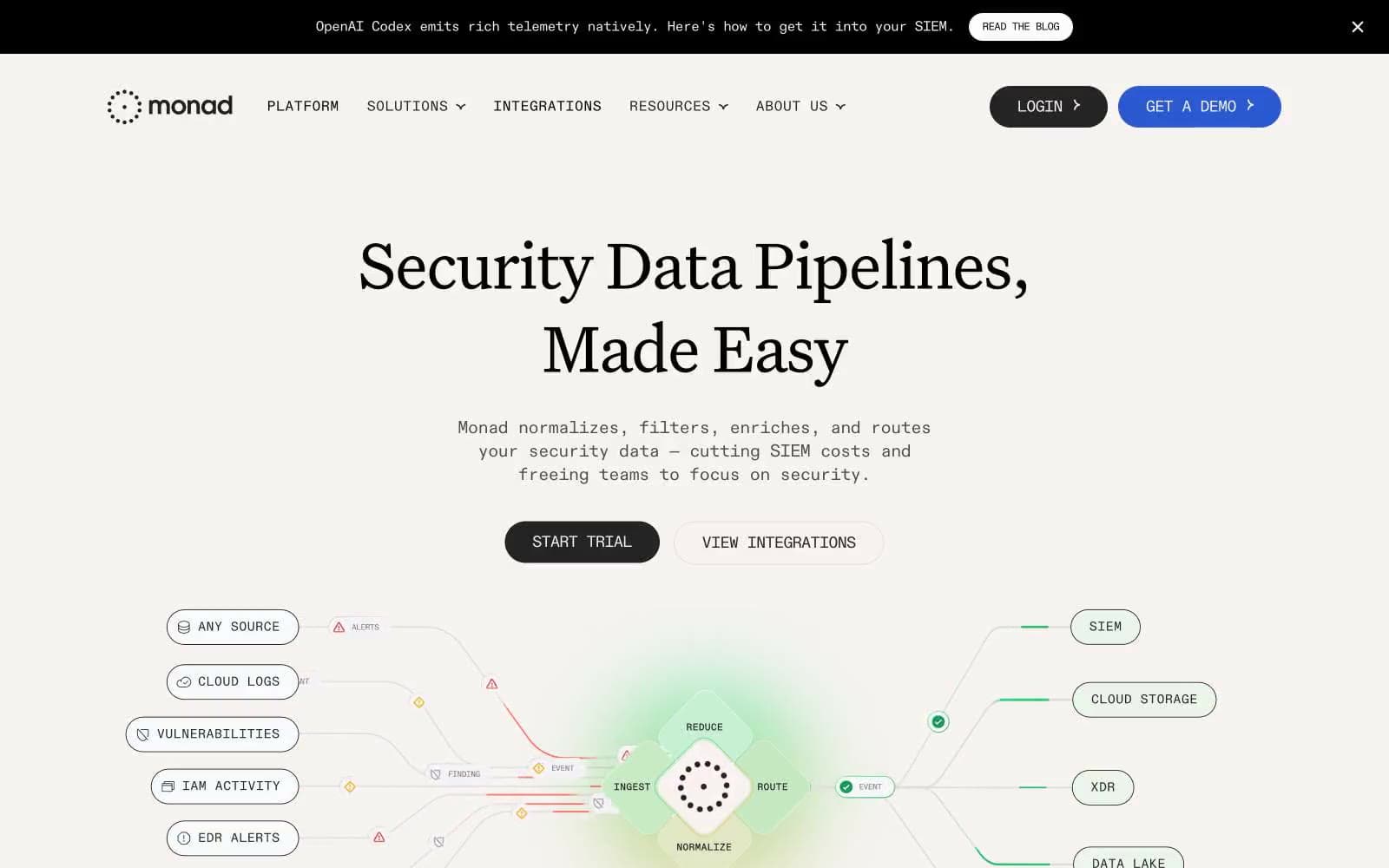
Monad design system

Brand2
Page canvas and the majority of surface fills — this warm off-white IS the brand's signature surface, immediately distinguishing the site from pure-white SaaS templates
Violet wash for highlight backgrounds, decorative bands, and soft emphasis behind content. Do not promote it to the primary CTA color
Accent6
Muted UI surface for disabled controls, low-emphasis panels, and placeholder blocks.
Decorative gradient stop — appears in atmospheric washes and the pipeline diagram's flow lines, never as a UI fill
Supporting palette color for small decorative accents when the core palette needs contrast.
Supporting palette color for small decorative accents when the core palette needs contrast.
Decorative gradient stop — warm accent in gradient washes, never used in functional UI
Decorative gradient stop — deep warm tone in gradient washes alongside gold and coral
Neutrals5
Announcement bar surface and certain heading fills — the black band at the top of the page and select heading contexts
High-contrast neutral action fill for primary buttons on light surfaces.
Secondary text — body copy and sub-headings that need less weight than primary headlines
Muted helper text and tertiary links
Hairline borders — 1px solid lines separating sections, outlining pipeline diagram nodes, and defining card edges
Try a pairing
Pick any two colors from the palette to check whether text stays readable on top.
Aa
Ink on Parchment
19.01 : 1 contrast
- Body textPasses AA 4.5
- Large textPasses AA 3
- StrictPasses AAA 7























