
Mode. Sunlit greenhouse editorial.
- SaaS
- Light theme
- 8 colors
- 4 typefaces
Mode uses a botanical-editorial language: a pale sage canvas (#eef2e3) replaces the usual sterile SaaS white, and a single chartreuse accent (#c8f169) punctuates actions with a sharp, almost fluorescent pop. The headline font is a custom serif (Grenette) at 56–96px with aggressive negative tracking — the words feel pulled tight, almost condensed, and they read like a magazine cover rather than a dashboard. Depth comes from a three-layer color stack (sage → forest green → chartreuse) rather than shadows; surfaces sit flat against each other and rely on hue contrast for hierarchy. Interactive elements use small 4px corner radii while cards and large surfaces use 16px, creating a consistent geometric vocabulary. The mood is confident, warm, and intellectual — BI without the corporate coldness.
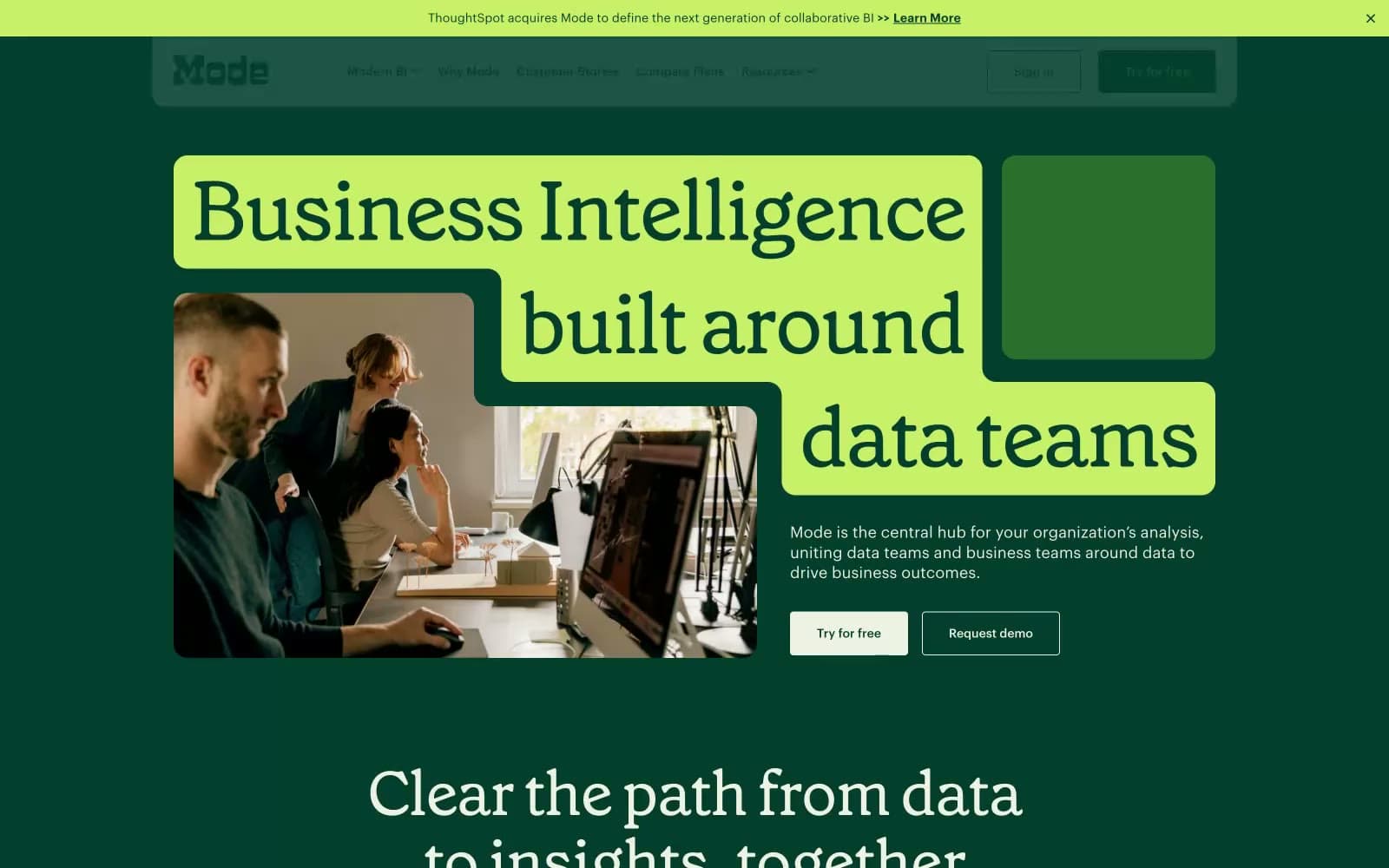
Mode design system

Brand3
Brand primary — dark section backgrounds, stat cards, nav text, primary text on light surfaces, dominant illustration color
Primary action button fill, accent highlights, tag/badge backgrounds, the singular chromatic punctuation across the UI
Hover/active state for forest surfaces, secondary green used in chart highlights and stat card accents
Accent1
Tertiary accent — decorative chart strokes, data visualization secondary color, support to chartreuse
Neutrals4
Primary text, icon strokes, hairline borders, ghost button outlines
Secondary text and icon fills — softer than pure black for muted UI elements
Page canvas, light card surfaces, eyebrow backgrounds, hero photo mats
Elevated card surfaces, nav background, modals, footer
Try a pairing
Pick any two colors from the palette to check whether text stays readable on top.
Aa
Paper White on Deep Forest
11.66 : 1 contrast
- Body textPasses AA 4.5
- Large textPasses AA 3
- StrictPasses AAA 7























