
Mews. Hospitality command center at pink dawn.
- SaaS
- Light theme
- 13 colors
- 1 typeface
Mews operates as a hospitality command center bathed in pink dawn: a predominantly white canvas, warm cream card surfaces, and a saturated candy-pink accent that drives every primary action. The visual language is unapologetically confident — headlines render at extreme weights (900) at display sizes, pushed tight with aggressive negative tracking, while body copy sits in a comfortable 400-weight Soehne. Surfaces stay flat and minimal; the few chromatic moments (soft pink, ice blue, lime green) are reserved for categorical tiles, product UI highlights, and the signature pill-shaped CTA. The result reads as a modern operating system for hotels: structured, optimistic, slightly playful, and decidedly not corporate-grey SaaS.
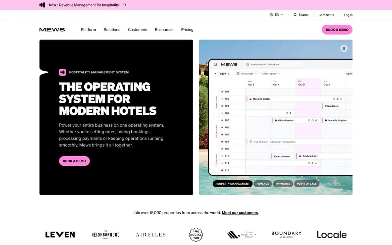
Mews design system

Brand3
Primary brand accent — pill-shaped CTAs, announcement bar background, active highlights; vivid pink against white is the visual signature
Softer pink surface for secondary buttons and pastel card variants
Lightest pink wash for category tile backgrounds and quiet brand surfaces
Accent2
Cool supporting accent for product UI screenshots, informational tiles, and category surface variation
High-energy accent for spotlight highlights, image overlays, and surprise moments — used sparingly for visual punctuation
Neutrals8
Primary text, icons, borders, and dark hero panels — the dominant structural color
Dark feature cards, inverse surface for hero blocks, and high-contrast panels
Secondary text and softer borders where pure black would feel too heavy
Muted helper text, disabled button fills, and tertiary borders
Cool-toned decorative borders, illustration fills, and subtle chrome highlights
Hairline dividers, nav separators, subtle structural borders
Card and elevated surface backgrounds, gentle warmth against pure white
Primary page background, top of surface stack
Try a pairing
Pick any two colors from the palette to check whether text stays readable on top.
Aa
Ink Black on Bubblegum
9.51 : 1 contrast
- Body textPasses AA 4.5
- Large textPasses AA 3
- StrictPasses AAA 7























