
Maze. Warm bone paper, serif ink, chartreuse highlighter.
- SaaS
- Light theme
- 11 colors
- 3 typefaces
Maze operates as an editorial research workspace: a warm cream canvas (#f5f4f0) that behaves like off-white paper rather than cold digital white, paired with Phonic — a sharp humanist serif set aggressively tight at large sizes. The interface is overwhelmingly monochromatic (near-black ink on warm bone), with a single chartreuse accent (#dbf570) that functions as highlighter rather than decoration. Screens are calm, generous, and content-led: product surfaces (report cards, study cards, video tiles) sit flat on the canvas with 8–16px radii and hairline borders, never floating on heavy shadow stacks. Sections break rhythm with full-bleed color washes (lavender, lime) and a large pixel-globe motif that signals research-at-scale. Buttons are quiet — either a dark filled rectangle or a thin outlined ghost — never glossy. The overall language is closer to a research journal than a SaaS dashboard.
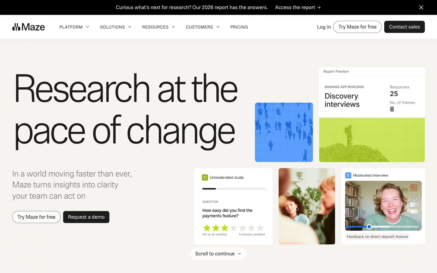
Maze design system

Brand2
Highlight badges, study tags, the globe motif, card accent fills — the only chromatic note in the system, used sparingly to draw the eye to research signals
Decorative border accent, chromatic link underline — the only deep color, appears in the olive outline treatments and the heading underline on the hero
Neutrals9
Hairline borders, icon strokes, the announcement bar — the thinnest line work
Primary text, dark filled buttons, heading color — the default ink, warm near-black rather than #000
Body annotations, meta labels
Secondary text, muted borders, body annotations
Input field borders, disabled controls
Hairline dividers, footer borders, low-contrast separators
Active tab background, subtle surface lift, button hover on bone
Page canvas, footer, secondary button fills — warm off-white replaces cold digital white, giving every screen a paper-like base
Card surfaces, elevated panels, input fields — the bright layer above bone
Try a pairing
Pick any two colors from the palette to check whether text stays readable on top.
Aa
Charcoal on Chartreuse
17.31 : 1 contrast
- Body textPasses AA 4.5
- Large textPasses AA 3
- StrictPasses AAA 7























