
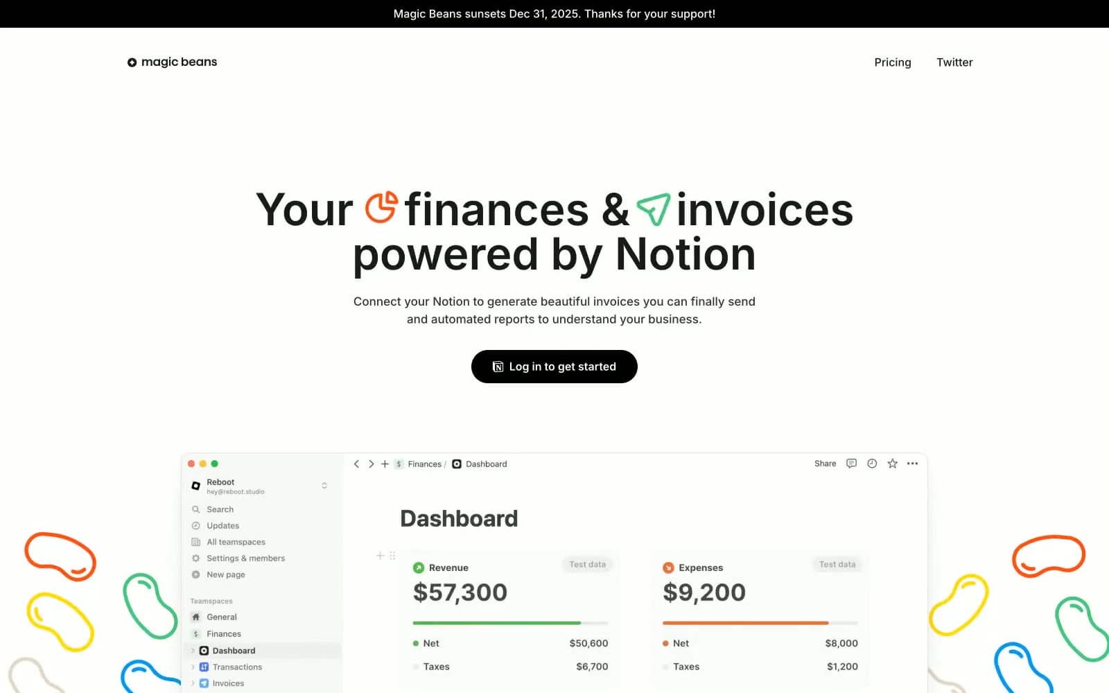
Magicbeans. Notion whiteboard with confetti.
- SaaS
- Light theme
- 13 colors
- 1 typeface
Magicbeans uses a playful Notion-adjacent language: warm off-white canvas, a single near-black pill CTA, and saturated color reserved exclusively for decorative squiggles and inline icons. The hero is the only loud element — a massive bold headline at 64px — and everything else stays quiet, monochrome, and border-driven rather than shadow-driven. Color functions as punctuation, never as structure: orange, green, and blue appear as tiny inline glyphs and wavy hand-drawn strokes scattered around the page edges, never as fills or buttons. Cards float on white against a slightly warm cream background, delineated by hairline gray borders rather than elevation, with a single layered card shadow used sparingly for the product screenshot only.
Magicbeans design system

Brand3
Decorative squiggle strokes, inline icon accent, brand heartbeat — warm vivid orange that defines the playful personality
Decorative squiggle fills, inline icon accent, growth-positive visual cue — saturated mid-green for energy without screaming
Decorative squiggle outlines, inline icon accent — the third color in the confetti triad used sparingly
Accent1
Green outline accent for tags, dividers, and focused UI edges
Neutrals9
Occasional hard-black fills for high-contrast accents and announcement bar
Primary text, pill CTA background, logo mark, icon strokes — near-black rather than pure black gives a softer, warmer feel than #000000
Body text, link color, secondary headings — warmer than Ink Black, used when pure black feels too heavy
Muted helper text, placeholder content, disabled states
Default border for cards, inputs, icons, nav separators, and table dividers — the most-used color in the entire system
Secondary card borders, subtle structural outlines
Soft green-tinted surface wash for highlighted sections, tag backgrounds, subtle callout zones
Page background — the slightly warm off-white that distinguishes this from a sterile pure-white SaaS look
Card surfaces, button text, elevated panels — the layer above the warm canvas
Try a pairing
Pick any two colors from the palette to check whether text stays readable on top.
Aa
Pure Black on Bean Orange
6.50 : 1 contrast
- Body textPasses AA 4.5
- Large textPasses AA 3
- StrictFails AAA 7























