
Loops. Like a stationer's print proof lit by afternoon sun.
- SaaS
- Light theme
- 12 colors
- 5 typefaces
Loops runs a warm, editorial light interface — cream paper (#faf9f7) instead of cold white, a serif display face (Newsreader) that gives marketing screens a magazine-cover gravity, and a single orange (#f97316) that barely appears, like a wax seal on an envelope. The product itself stays almost entirely achromatic: dark pill buttons, hairline stone-toned borders, and flat surfaces with no decorative gradients. Components feel like printed editorial stationery — generous line-height, tight tracking on display, small tags as 999px pills, and elevation reduced to a single hairline inset shadow. An AI agent should treat orange as a signal, not a chrome — it should only fire on the logo, status pips, and small icon accents — while the primary action is always the dark charcoal pill (#1c1917 fill, white text).
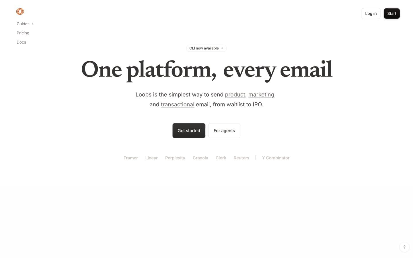
Loops design system

Brand1
Orange decorative accent for icons, marks, and small graphic details
Neutrals11
Primary headings and filled button background — the near-black with a warm cast that harmonizes with Parchment; use instead of #000 for all text and CTA fills
Deep border tone for card hairlines and inset shadows on elevated elements
High-emphasis body text, button text on light surfaces
Link text at rest, nav labels, mid-priority body text
Secondary text, timestamps, breadcrumb trails
Muted helper text, disabled labels, icon stroke at rest
Stronger dividers and hover-borders where more separation is needed
Default hairline border — button outlines, card edges, input borders
Subtle secondary surface — hover states on tag pills, tinted code snippet backgrounds, gentle section differentiation without borders
Page canvas — the warm off-white that defines the entire experience; never substitute pure #ffffff at the body level
Card surfaces, code blocks, and inset panels sitting on Parchment
Try a pairing
Pick any two colors from the palette to check whether text stays readable on top.
Aa
Warm Ink on Ember
6.24 : 1 contrast
- Body textPasses AA 4.5
- Large textPasses AA 3
- StrictFails AAA 7























