
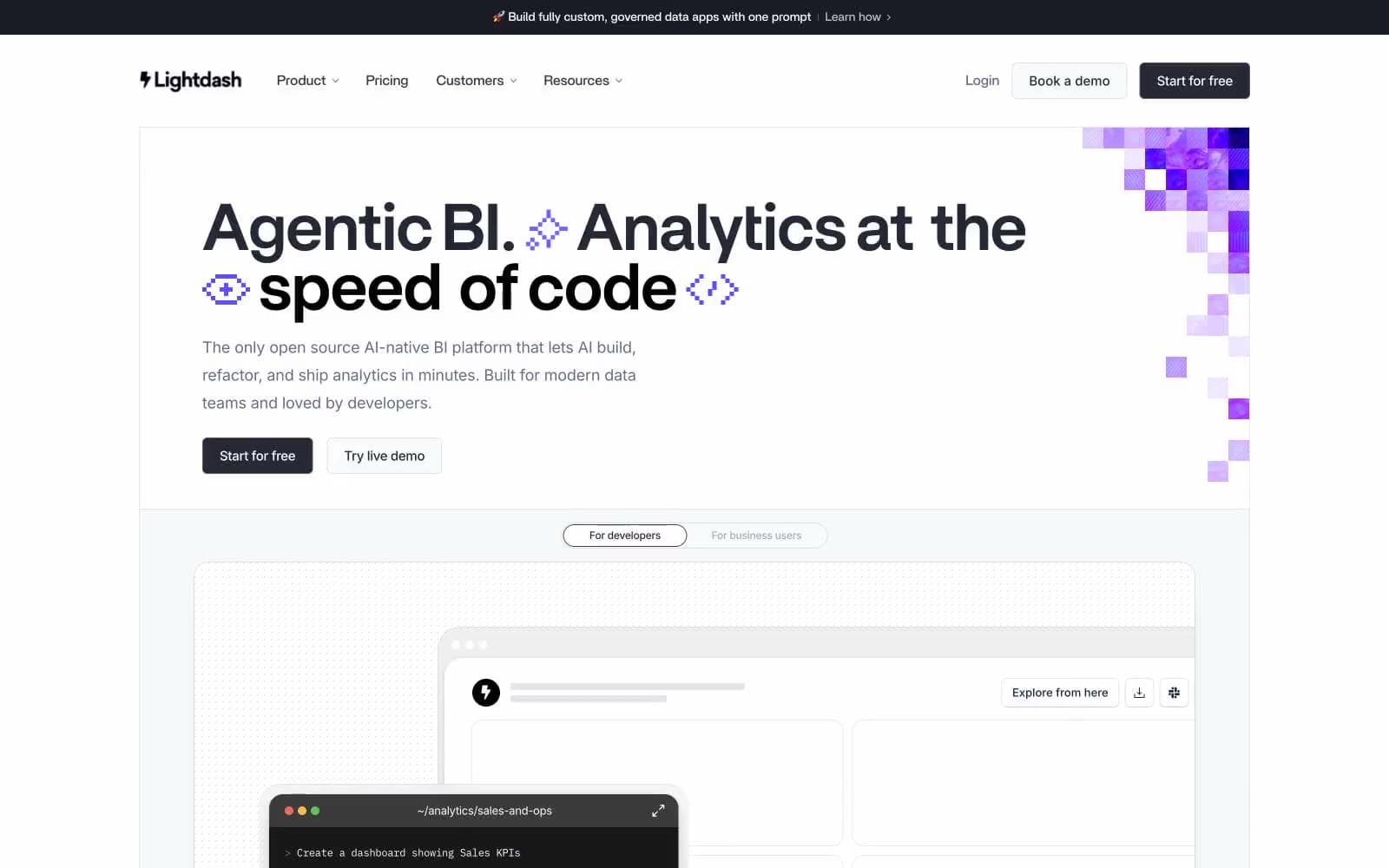
Lightdash. Violet pixel-grid on drafting paper.
- SaaS
- Light theme
- 14 colors
- 7 typefaces
Lightdash operates as a calm, developer-first command center: a near-white canvas populated by slate-gray typography, subtle hairline borders, and one saturated violet (#5e4cff) that powers every interactive moment. The brand voice is confident and quiet — headlines are set in a custom geometric sans (Britti Sans) at 48–76px with aggressively tight tracking (-0.025em), making them feel architectural rather than decorative. Body copy uses Inter at 14–18px with slightly negative letter-spacing, keeping dense information readable without feeling heavy. Surfaces layer gently from #ffffff canvas to #f6f8fa sections to 12px-rounded cards, and a pixel-art violet mosaic in the hero is the only ornamental gesture — a deliberate nod to the 'code-native' identity. Components are flat and borderless-by-default; elevation is borrowed from layered rgba shadows tinted with the brand's slate (#272835) rather than neutral gray, which keeps every card visually on-brand.
Lightdash design system

Brand1
Primary CTA fill, active link, brand accent — vivid violet against slate neutrals is the single chromatic punctuation of the entire system
Accent2
Muted accent background, hero pixel-art mid-tones, tag chips
Tertiary accent surface, selected row tint, soft callout
Neutrals11
Deepest text, high-contrast dark surfaces
Dark surface fills, announcement bar, code terminal background, primary button background
Primary headings, strong body text, high-emphasis content
Secondary body text, descriptions, supporting paragraphs
Muted metadata, timestamps, caption text
Helper text, link underlines in body copy, placeholder text
Secondary borders, disabled state outlines
Hairline dividers, card borders, table separators
Tertiary surface, muted background blocks
Alternate section background, subtle surface tier below white
Primary page background, card surfaces, input fills
Try a pairing
Pick any two colors from the palette to check whether text stays readable on top.
Aa
Canvas White on Volt Violet
5.31 : 1 contrast
- Body textPasses AA 4.5
- Large textPasses AA 3
- StrictFails AAA 7























