
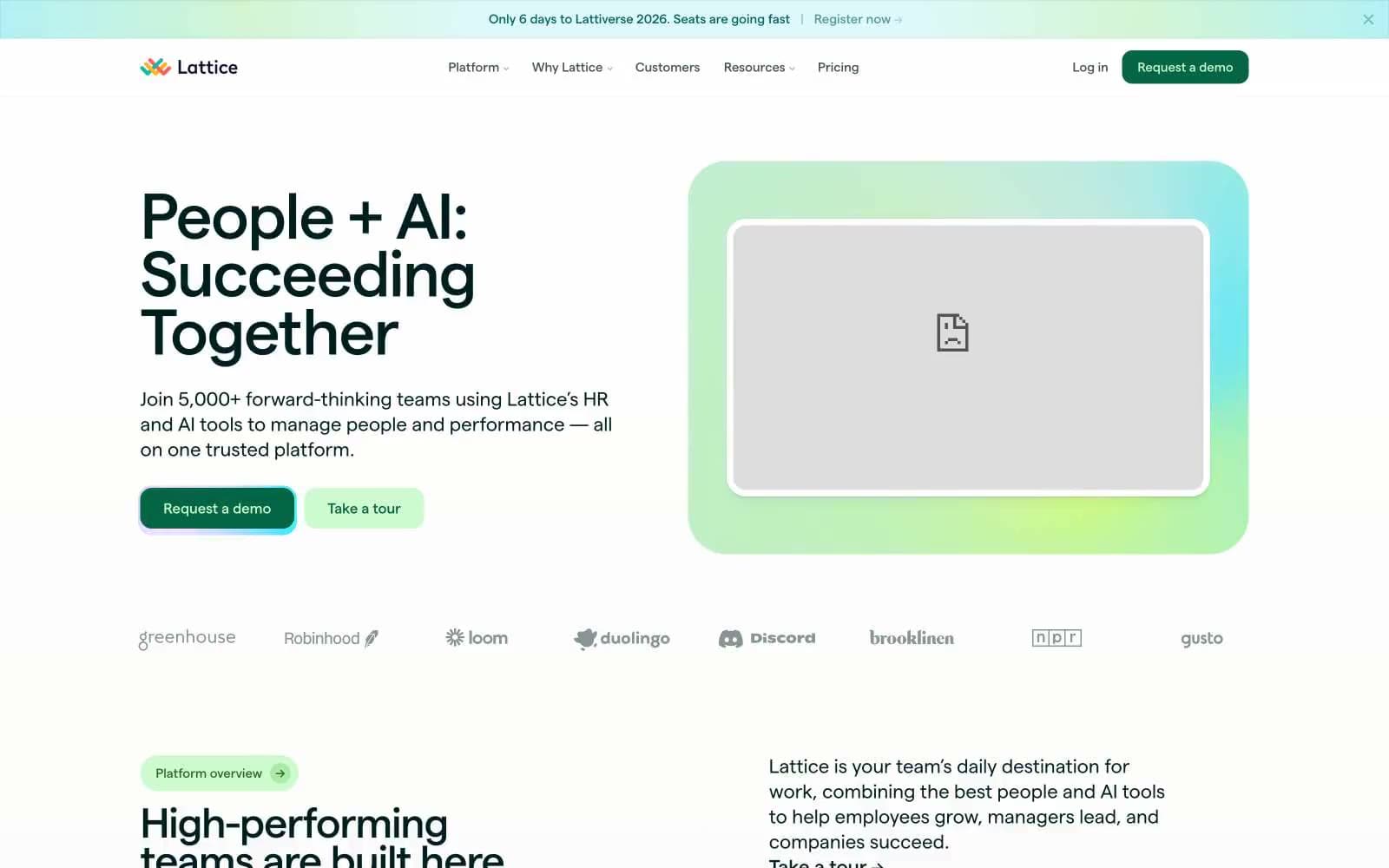
Lattice. A quiet cream canvas where dark forest ink does the speaking and pastel specimen cards provide the color.
- SaaS
- Light theme
- 23 colors
- 1 typeface
Lattice reads like a botanical field journal rendered in product form: a warm parchment canvas (#f7f6f2) carries the entire site, with a single near-black forest ink (#001f1f) doing the heavy lifting as both primary text and primary action surface. The signature is a system of pastel-tinted feature cards — mint, lime, lavender, buttercream — each color-coding a product module like a specimen tray, paired with dark filled and outlined buttons in the same forest green. Typography is a single geometric sans (Matter) at compact sizes, with tight tracking on large display copy and wide tracking on small uppercase labels. Everything sits on generous rounded corners (14–29px), soft 1px-tinted shadows, and zero decorative noise — color appears as functional punctuation, not ornament.
Lattice design system

Brand3
Neutral form states, badge text, and quiet UI feedback where color should stay understated. Do not promote it to the primary CTA color
Dark green accent for data visualization, illustration strokes, and secondary green elements. Distinct from Forest Ink in that it reads clearly as green, not near-black
Secondary brand accent — teal-toned borders, illustration fills, and data visualization. Used alongside Deep Forest for multi-color charts and decorative elements
Accent14
Pill badge fills, success highlights, and light accent surfaces. The signature light green for category tags, status indicators, and soft highlight washes
Chart and illustration accent — the yellow-green in the multi-color palette system. Used in data bars, category indicators, and decorative strokes
Magenta-pink accent for data visualization and illustration. The warm-cool counterpoint in the multi-color palette system
Amber-gold accent for data visualization and illustration. The warm yellow in the multi-color palette system, used in charts and decorative strokes
Violet accent for data visualization, illustration strokes, and the integrations section gradient. The cool counterpoint in the multi-color palette
Pastel feature card background — the pale aqua tint assigned to product modules like Performance. Each product area gets its own pastel home
Pastel feature card background — the pale yellow-green tint for modules like Goals & OKRs. The warmest pastel in the system
Pastel card background — pale violet for testimonial cards, secondary feature blocks, and the cool side of the pastel system
Pastel card background — near-white pink for subtle surface differentiation. The quietest of the pastel tints
Warm pastel accent surface — soft yellow for tag backgrounds and light highlight zones
Green pastel accent for tag backgrounds and soft category highlights. A more saturated green than Lime Surface
Pink pastel accent for tag backgrounds and soft category highlights
Muted violet for illustration strokes and decorative outlines
Hero radial gradient — the lime-to-teal aurora behind the product device frame. Evokes a natural, organic light source rather than a tech glow
Neutrals6
Dark borders and separators for elevated surfaces and inverted UI. Do not promote it to the primary CTA color
Secondary text and medium-emphasis borders. Sits between Forest Ink and the lighter grays — use for body descriptions, supporting copy, and subtle dividers
Muted body text, nav borders, and tertiary UI elements. The readable-but-quiet gray for descriptions and helper text
Lightest text tier — captions, metadata, tertiary labels. Use for timestamps, footnotes, and non-essential annotations
Page background — the warm off-white canvas that gives the entire system its paper-like, non-clinical feel. Never use pure white for the body background
Card surfaces, product UI mockups, and embedded media containers — pure white lifted above the parchment canvas to create subtle elevation without shadows
Try a pairing
Pick any two colors from the palette to check whether text stays readable on top.
Aa
Paper White on Forest Ink
17.27 : 1 contrast
- Body textPasses AA 4.5
- Large textPasses AA 3
- StrictPasses AAA 7























