
Krepling. Quiet white atelier with one violet spark.
- SaaS
- Light theme
- 7 colors
- 2 typefaces
Krepling's design system is a near-monochrome canvas where black text and white surfaces carry the interface, and a single vivid violet (Bolt Violet) provides the only chromatic voice for actions, links, and interactive states. The layout breathes: generous whitespace, a comfortable density, and section rhythm built from large typographic jumps (16px → 80px) rather than colored bands. Surfaces are flat — borders and subtle background tints (#f1f1f1) define elevation; shadows are essentially absent. Rounded geometry is consistent (8px for cards/buttons, 14px for larger containers), reinforcing a soft, approachable feel. The system is counterweighted by playful 3D-rendered decorative objects in saturated hues — these are pure atmosphere, never UI tokens.
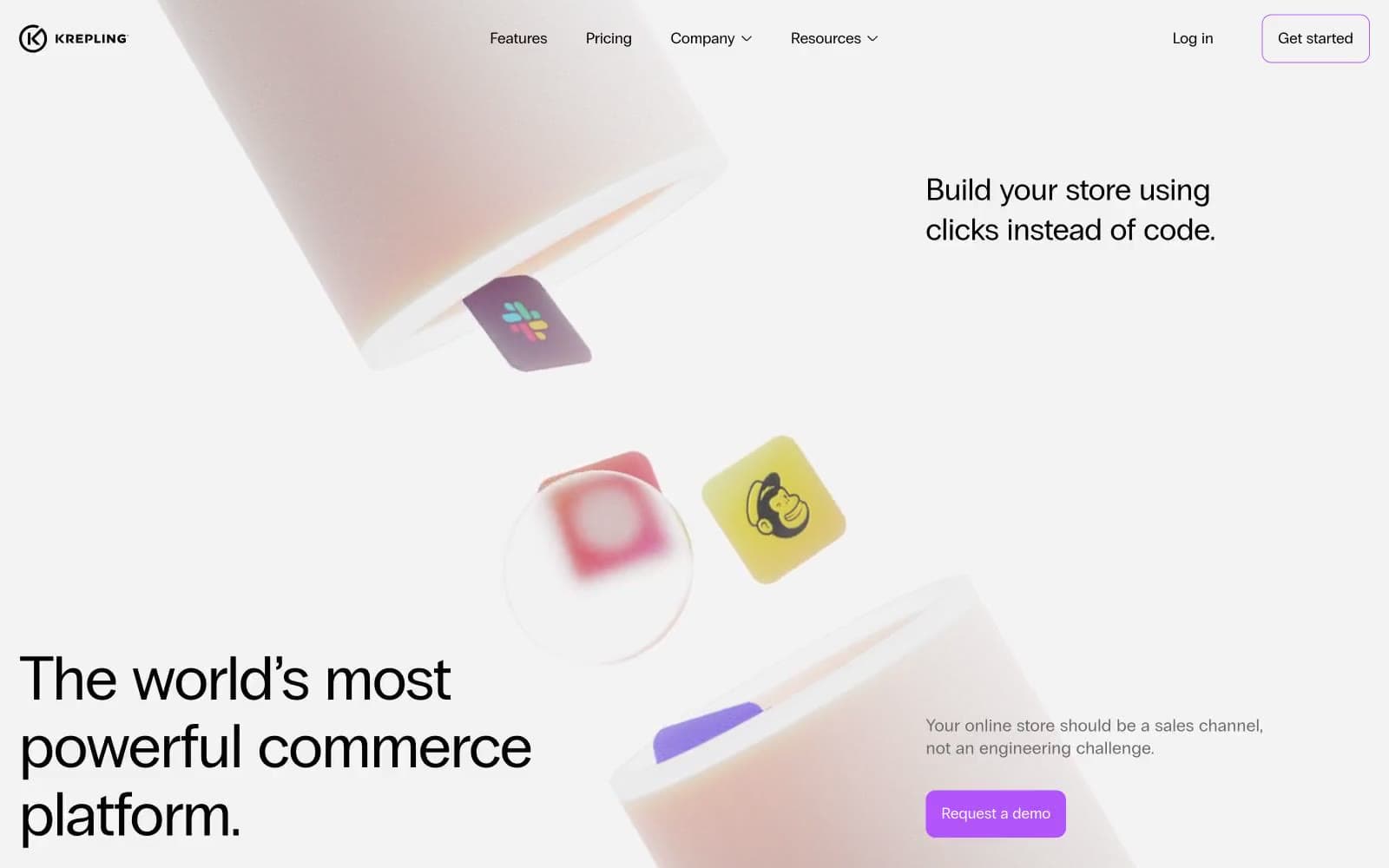
Krepling design system

Brand1
Filled CTA backgrounds, link borders, active tab indicators — the sole chromatic signal in the system
Neutrals6
Primary text, headings, icon strokes, nav labels, all hairline borders and dividers
Footer background, near-black text where softer than pure ink is needed
Secondary/helper text, muted icons, disabled states, low-priority borders
Subtle card borders, placeholder text, low-contrast dividers
Alt-surface tint for sub-sections, secondary card backgrounds, hover wash
Page canvas, card surfaces, button text on filled CTAs, reversed text in dark zones
Try a pairing
Pick any two colors from the palette to check whether text stays readable on top.
Aa
Ink Black on Bolt Violet
5.51 : 1 contrast
- Body textPasses AA 4.5
- Large textPasses AA 3
- StrictFails AAA 7























