
Ko-fi. Warm café chalkboard on cream paper.
- SaaS
- Light theme
- 7 colors
- 4 typefaces
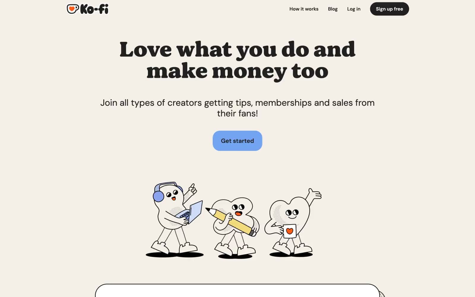
Ko-fi reads like a warm indie café menu printed on recycled card stock. A cream page canvas replaces the cold white typical of creator tools, and a custom chunky display font stamps hero headlines with a hand-set zine energy while DM Sans keeps everything readable. Every interactive element is aggressively rounded — pill buttons, pillow-soft cards, capsule inputs — giving the whole system a tactile, sticker-book quality. Black 2-3px borders wrap photo and card surfaces instead of shadows, reinforcing the cut-out-and-paste craft aesthetic. A single soft periwinkle blue punctuates the otherwise warm neutral palette as the one and only accent, reserved for primary actions so they always feel like the most important thing on screen.
Ko-fi design system

Brand2
Blue wash for highlight backgrounds, decorative bands, and soft emphasis behind content. Do not promote it to the primary CTA color
Primary action hover/pressed state, saturated Kofi Blue variant
Neutrals5
Heavy borders on cards, images, and the logo wordmark — the signature outline that makes elements feel cut from paper
Primary text, dark filled buttons, dark icon fills
Secondary surface — feature card backgrounds, warm button fills, tag backgrounds
Page canvas, subtle borders, hairline dividers — the base everything sits on
Card surfaces above the cream canvas, text on dark buttons, input field fills
Try a pairing
Pick any two colors from the palette to check whether text stays readable on top.
Aa
Sticker Black on Kofi Blue
12.41 : 1 contrast
- Body textPasses AA 4.5
- Large textPasses AA 3
- StrictPasses AAA 7























