
Kindsight. An earthy, editorial calm built from cream paper, olive ink, and a single flash of chartreuse highlight.
- SaaS
- Light theme
- 11 colors
- 2 typefaces
Kindsight operates in a warm, editorial register that reads more like a design magazine than a SaaS dashboard. A cream canvas (#faf5f1) holds the page, with a deep olive hero (#3d4128) creating an earthy, almost botanical atmosphere. Display type uses Times Now at whisper weights (200-300) with aggressive negative tracking, producing compressed, magazine-cover headlines. A single chartreuse accent (#e1f079) appears as decorative highlight — underlines beneath italic display words, badges, illustration fills — never as a utility color. Terracotta (#de7653) is the only CTA color, appearing as solid filled buttons or thick outlined pills. Components favor generous 24px card radii, thin hairline borders, and zero or very subtle elevation; the design relies on tonal contrast between cream, near-black with green undertones (#0e0f0a), and the dark olive hero block to create depth rather than shadows.
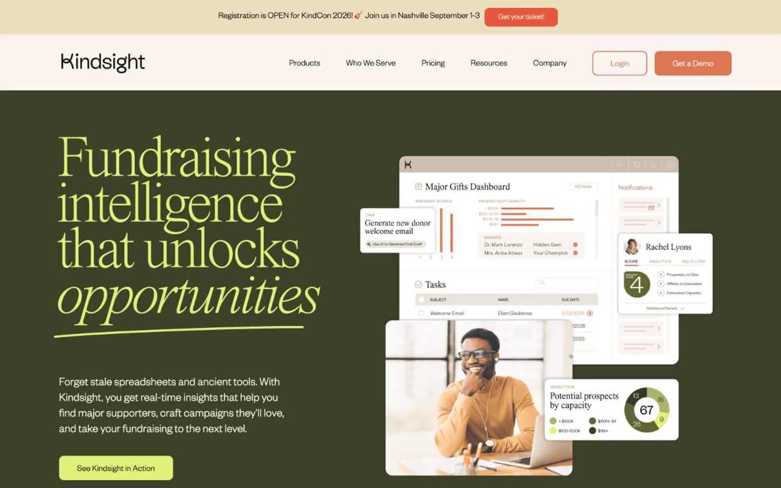
Kindsight design system

Brand3
Hero panel background, dark accent surface — earthy green-black anchors the brand and gives the chartreuse somewhere to glow
Orange action color for filled buttons, selected navigation states, and focused conversion moments.
Outlined/ghost CTA variant, secondary action borders — a deeper, redder cousin of terracotta for outlined button treatment
Accent1
Green action color for filled buttons, selected navigation states, and focused conversion moments.
Neutrals7
Body text fallback, secondary borders
Primary text, borders, icons — near-black with a subtle green undertone that warms the entire palette
Input field text, deepest green-black for hairline borders on dark surfaces
Muted section dividers, secondary card backgrounds, beige illustration fills
Page background, nav surface, warm canvas base
Card surface, slightly brighter than canvas for subtle elevation
Button text on filled terracotta, pure white highlights
Try a pairing
Pick any two colors from the palette to check whether text stays readable on top.
Aa
Pure White on Olive Grove
10.58 : 1 contrast
- Body textPasses AA 4.5
- Large textPasses AA 3
- StrictPasses AAA 7























