
Kagi. Private reading room.
- SaaS
- Light theme
- 14 colors
- 3 typefaces
Kagi — private reading room. The interface uses an expansive white canvas, near-black type, and centered editorial compositions that make search feel like a quiet utility rather than an advertising surface. Lufga’s rounded geometric forms carry large, weight-600 headlines and compact navigation, while purple links and pastel product panels introduce color only at ecosystem touchpoints. Dark graphite bands invert the system for FAQs and the footer, with restrained shadows reserved for the search field and framed product screens.
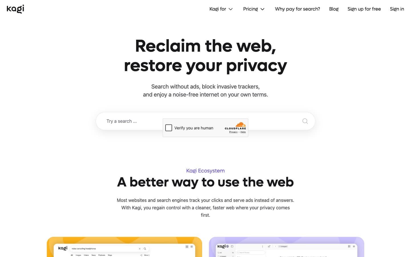
Kagi design system

Brand1
Inline links, ecosystem eyebrows, and textual product signposts — the single vivid signal within the graphite-and-white interface
Accent3
Assistant and product-demo card backgrounds
Search product-demo card background
Supporting promotional card background
Neutrals10
Primary text, navigation, dark FAQ and footer surfaces, filled capsule buttons
Inset dark surfaces, dark-field background, dark accordion separators
Secondary body copy, dark-section dividers, subdued card copy
Placeholder text, secondary icon strokes, muted control text
Muted footer labels, disabled-looking icon strokes, low-emphasis details
Footer copy and subdued inverted text
Cool-tinted product-card and supporting showcase surface
Hairline borders, pale outlined-card edges, quiet surface separators
Pale selected-chip and minor highlighted-link surface
Page canvas, search field, white utility cards, text on Graphite 1000
Try a pairing
Pick any two colors from the palette to check whether text stays readable on top.
Aa
White on Kagi Violet
4.92 : 1 contrast
- Body textPasses AA 4.5
- Large textPasses AA 3
- StrictFails AAA 7























